7 concepts18 worked examples29 exercises4 exam-level7 figures
What are you here for?
11 Plotting with pyplot: the current figure, the format string, the five decorating calls, panels with subplot, and bar, pie and histogram charts
Start with this
One question before you read anything. Getting it wrong is the point: it shows you what this section is for.
§11.0 — a parallel list that came out short
Three things from earlier weeks decide whether a plotting program works, and all three are about lists rather than pictures. Here is the first. A student wants hour numbers to go with four temperature readings, writes the loop below, and then wonders why the plotting call complains.
Find(a) Write exactly what this prints, all three lines.
Given
temps = [12, 15, 19, 23]
hours = []
for i inrange(1, len(temps)):
hours.append(i)
print(hours)
print(len(hours), len(temps))
print(len(hours) == len(temps))
IPython console
In [1]: %run untitled0.py
The loop starts at 1 to make the hours read like hours, and pays for it with one missing value. The fix keeps the loop over range(len(temps)) and shifts inside the body: hours.append(i + 1), which gives four values [1, 2, 3, 4].
Hint 1/4
The question is not whether the loop is sensible. It is how many times the loop body runs, and that is fixed by the two numbers inside range.
Hint 2/4
range(a, b) yields a, a+1, ..., b-1, so it yields b - a values. Here a is 1 and b is len(temps).
Hint 3/4
len(temps) is 4, so range(1, 4) yields 1, 2, 3: three values, appended in that order. The data again: temps = [12, 15, 19, 23], and hours starts empty.
Hint 4/4
Three numbers in hours, four in temps, so the last line is False.
Show solution
Count what range yields
$$\texttt{range(1, 4)} \rightarrow 1, 2, 3$$
range stops before its second argument, so the last value is 3 and not 4
$$\texttt{len(hours)} = 3$$
one append per value yielded, and three values were yielded
Read the prints
$$\texttt{[1, 2, 3]}$$
printing a list shows it in brackets with commas, which is not what the x axis will show but is what print shows
$$\texttt{3 4}$$
two arguments to one print are separated by a single space
$$\texttt{False}$$
3 is not 4, and this is the line the plotting call would have complained about later
Independent check by the other route: the loop body runs once per value of range, and range(1, 4) has 4 - 1 = 3 values, which agrees with the printed 3.
An x list built with range(1, len(y)) is always one short. Build it over range(len(y)) and add one inside.
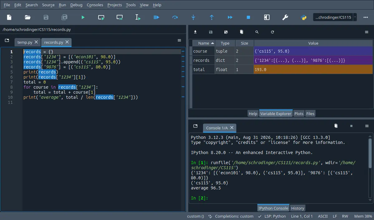
What this looks like in Spyder
The tab next to Help. It lists every name your program left behind with its type and its size, so it answers the one question a listing cannot: what is in this name right now. The stepper on this page shows the same four columns.
Spyder 5.5.1 on Linux, running the program in its own editor. A different version moves a few toolbar icons; the panes are named the same.
Your program has just printed twelve numbers into the console and the lab step says: report the month with the largest swing. You read the row three times, get two different answers, and start counting on your fingers. The lab paper next to you shows the same twelve numbers as a picture, and in that picture the answer is one second of looking.
By the end of this section you can take any two lists of numbers and produce a titled, labelled, limited with one or more , and you can say in advance which of your calls will land in which panel.
In 60 seconds
Every pyplot call lands in one place, the current panel of the current figure, so plotting is two questions: which panel am I in, and which call puts what on it.
The forms of plot
$$\begin{aligned}&\texttt{plot(y)} &&\Rightarrow\; x=0,1,\dots,n-1\\&\texttt{plot(x, y)} &&\Rightarrow\; \texttt{len(x) == len(y)}\\&\texttt{plot(x, y, 'r*-')} &&\Rightarrow\; \text{colour}+\text{marker}+\text{line style}\\&\texttt{plot(x, a, x, b)} &&\Rightarrow\; \text{two curves from one call}\end{aligned}$$
Every figure. The first form is a quick look, the second is what a spec with a named x axis needs, the third turns a described look into one short string, and the fourth draws several without a second call.
The frame, in this order
$$\texttt{axis([xmin, xmax, ymin, ymax])}$$
A spec says the axis bounds come from the data: build the four numbers with min and max, then pass the list.
Panels, counted along the rows
$$\texttt{subplot(m, n, p)},\quad p=1,2,\dots,m\cdot n,\quad p=(r-1)\cdot n+c$$
More than one picture in one figure window. The call also makes that panel the current one.
You want the shape of one list of measurements rather than the measurements themselves.
Three most common mistakes
Passing one list to plot and then labelling the x axis as if it started at 1. With one list the first point sits at x = 0.
Decorating before switching panels, or after switching away from the panel you meant. Every title, label, legend and axis call goes to the panel the last subplot call selected.
Naming the series in legend in a different order from the plot calls. Nothing goes wrong on the screen except that every label is on the wrong curve.
The weights for this course are labs 20, midterm 40 and final 40. This material is the one the plotting lab, the tenth in the lab sequence, is built on, and a long programming question can ask for a script that prints some lists and then produces a described figure. In one past final paper the plotting question carried 20 of the paper's 100 points and its parts were not weighted separately; that is one paper, not a rule, so read your own paper's numbers. What is safe to assume is that a figure with no title and no labels is an unfinished figure.
How much time do you have?
10 minutes
The forms of plot, including the one call that takes several x, y pairs, the four numbers axis wants and in which order, and the five calls that turn a bare curve into something a marker can read.
The 60-second card · plot with one list and plot with two · title, xlabel, ylabel, legend, grid and axis · Formula card
45 minutes
Enough to write a full plotting script from a written spec: panels, series, format strings, labels, limits and a legend, and to say what a plotting program will draw before you run it.
The 60-second card · The current figure and the current panel · plot with one list and plot with two · The format string · title, xlabel, ylabel, legend, grid and axis · subplot(m, n, p) · Scaffolding comes off · B · computation
full read
Everything, including the three category charts, the binning loop that shows what hist is doing, and the twenty ways this material goes wrong.
The 60-second card · Recall first · Conventions · The current figure and the current panel · plot with one list and plot with two · The format string · title, xlabel, ylabel, legend, grid and axis · subplot(m, n, p) · Categories instead of a curve · hist · Method boxes · Look-alike pairs · Scaffolding comes off · Full exam-style question · Practice set · Mistake ledger · Glossary
By the end of this section
Predict which figure and which panel a pyplot call will change, and say what clf leaves behind.
Plot a list of measurements against the x values you intend, and check that the two lists have the same length.
Write the format string for a colour, a marker and a line style described in words, and read one back the other way.
Label a panel with title, xlabel, ylabel, grid and legend, and set its four from the data with min and max.
Split one figure into panels with subplot and decorate the panel you meant to decorate.
Draw a grouped bar chart and a pie chart from category data, and place the two groups of bars so that neither hides the other.
Bin a list of measurements into a , and say how many observations fall in a given bin before the chart is drawn.
Syllabus coverage
covered
Plotting — covered
The pyplot interface as the course uses it
the current figure and the current panel
clf
plot with one list and with two
the colour and marker and line style format string
title
xlabel
ylabel
legend
grid and axis
subplot for several panels in one figure
the three charts for data that is not a curve: bar
pie and hist
covered
Chapter 11 — covered
The plotting half of the chapter, which is the half this week's lecture materials use: producing a figure from lists of numbers and formatting it. The chapter's other half returns to writing classes, and classes were this course's material three weeks earlier, so nothing new about them is introduced here.
deferred
Fitting a line to measured points with polyfit and polyval — deferred
The lecture slide deck for this week ends with a spring experiment, Hooke's law, and a least squares fit drawn on top of the measured points.
Deferred to the section on understanding experimental data, where the syllabus puts it and where the fitting, not the drawing, is the subject. The drawing side it needs is all here: two series in one panel, a format string with markers only for the measurements, a solid line for the model, a legend naming both.
no material
the array library the lab data arrives in — no material
This week's lab and tutorial material reads its measurements into arrays rather than lists and then does arithmetic on them. This page draws from plain lists instead.
No course-plan line owns the array library: this week is only Plotting (Chapter 11), the earlier arrays week uses lists, and the next two are random walks and experimental data. It is introduced nowhere and not examinable here. Drawing costs nothing (a plotting call takes lists and arrays alike); the cost is arithmetic, see the conventions block above.
off syllabus
show, and the figure window outside Spyder — off syllabus
Why none of the lecture programs end with a show call, and the one line you need if you run the same file from a terminal instead.
Not in the syllabus line and not in the course materials, which run inside Spyder where the figure appears by itself. It is here in one sentence because a student who runs the same file outside Spyder sees no window at all and thinks the program is broken. Not examinable.
Recall first
Building a second list of the same length in a loop
The pattern from the list week, unchanged:
out = []
for i inrange(len(data)):
out.append(i + 1)
range(len(data)) gives 0, 1, ..., len(data) - 1, so out ends up as long as data.
Almost every plotting task needs an x list that is exactly as long as the y list, and this is how you build it when the x values are not in the file.
min, max, sum and len on a list of numbers
min(L) and max(L) return the smallest and the largest item of one list. sum(L) adds them, len(L) counts them, and sum(L) / len(L) is the average as a float. Careful: min(A, B) with two lists does not look inside them the way you want.
Axis limits in this course come from the data, so every frame you set is four calls to min and max.
format for a fixed number of decimals
format(value, '.1f') returns a string with one digit after the point, and format(x, '.2f') two. It returns a string, it does not change value.
Percentages written onto a pie chart and numbers written into a title are formatted, not rounded by hand.
Reading two columns out of a text file
From the files week:
f = open('data.txt', 'r')
f.readline()
for line in f:
    parts = line.strip().split(',')
    xs.append(int(parts[0]))
f.close()
readline() before the loop throws away one header line, strip() removes the newline, and split returns a list of strings that still have to be converted.
The plotting lab reads its numbers from a file, so the first third of that program is file work and only the last third is plotting.
sort changes the list, sorted hands back a new one
L.sort() reorders L and returns None. sorted(L) leaves L alone and returns a new sorted list.
A plot of a sorted copy and a plot of the list you were given are different pictures, and the one line that confuses them returns None into your y list.
Try it yourself first (2 questions)
1§11.0 — min of two lists is not the min of both
The second one. Axis limits come from the data, so a student reaches for min and max and writes what looks like the obvious thing for two lists at once.
Find(a) Write exactly what this prints, all three lines.
The first line is the trap: min with two arguments returns the smaller argument, and comparing two lists compares their first items, so it hands back a list where you wanted a number. Passing that into axis would not give an error message you can read. The last line is the spelling you want: one min and one max, each over a single list.
Hint 1/4
Ask what each call is being handed. In the first line min gets two arguments; in the second it gets one.
Hint 2/4
With two arguments, min compares the arguments themselves and returns the smaller argument. Two lists are compared item by item from the front, so the answer is one of the lists. With one argument, min looks inside it.
Hint 3/4
The lists again: max_t = [8, 11, 17] and min_t = [-4, -3, 1]. For line one, compare -4 against 8. For line two, min_t + max_t is one list of six numbers.
Hint 4/4
Line one prints the whole list [-4, -3, 1], line two prints -4, and line three prints the two numbers you actually wanted.
Show solution
Separate the two ways of calling min
$$\texttt{min(min\_t, max\_t)}$$
two arguments, so the comparison is between the arguments and the result is one of them
$$-4 < 8 \Rightarrow \texttt{[-4, -3, 1]}$$
lists compare from the front, and the first items settle it at once
Independent check on the middle line: the six numbers are -4, -3, 1, 8, 11, 17 and -4 is visibly the leftmost on a number line, so the printed -4 is right.
For a frame over two series write min(min(a), min(b)), never min(a, b).
2§11.0 — the average, and the two slashes
The third one. An average decides where a reference line goes, and there are two division operators that both look plausible.
Find(a) Write exactly what this prints, all four lines.
Three spellings of one quotient: the exact float, the floor, and the rounded string. The third line is the one that quietly misplaces a reference line by three quarters of a unit, and the fourth is what you would write into a title.
Hint 1/4
Add the four numbers first. Then treat the three divisions as three different questions, because they give three different kinds of answer.
Hint 2/4
/ always produces a float. // throws away the fractional part and keeps an int here. format(v, '.1f') produces a string rounded to one decimal.
Hint 3/4
The data again: diffs = [12, 14, 16, 17], four items. 12 + 14 + 16 + 17 = 59, and 59 / 4 = 14.75.
Hint 4/4
59, then 14.75, then 14, then 14.8.
Show solution
Add the four
$$12+14+16+17 = 59$$
sum walks the list once, and this is the number every line below divides
Divide three ways
$$59 / 4 = 14.75$$
true division keeps the fraction and its result is a float, so it prints with a point
$$59 // 4 = 14$$
floor division discards 0.75; both operands are ints so the result prints without a point
Independent check on the average: the four values straddle 14.75 with 12 and 14 below and 16 and 17 above, and the two gaps below (2.75 and 0.75) add to the same 3.5 as the two gaps above (1.25 and 2.25), so 14.75 is the balance point.
Use / for an average. // is for an index or a count, never for a quantity you are going to draw.
Notation
symbol
reads as
means
watch out
$plot(x, y)$
plot y against x
Draw a curve through the pairs (x[0], y[0]), (x[1], y[1]) and so on, in the current panel.
The x list comes first. Writing plot(y, x) draws a different, usually meaningless, curve and raises no error.
$'r*-'$
red, star markers, solid line
The optional third argument of plot: one letter for the colour, one or two characters for the marker, one or two for the line style.
It is a single string in quotes, not three arguments. Leaving out the line style part means no line is drawn at all.
$[xmin, xmax, ymin, ymax]$
the four frame numbers, x first
The list axis takes, in that fixed order.
Both x numbers come before both y numbers. If you put ymin second you will silently get a frame nobody asked for.
$subplot(m, n, p)$
m rows, n columns, panel number p
Split the figure into an m by n grid of panels and make panel p the current one.
p starts at 1, not at 0, and it counts along the first row before moving to the second.
$align='edge'$
align on the edge
A keyword argument of bar: the position you give is an edge of the bar rather than its centre.
With a negative width the bar then grows to the left of that position, which is how two groups end up side by side around one .
$autopct='%1.1f%%'$
print the percentage with one decimal
A keyword argument of pie: write each slice's share on the slice, computed from the sizes you passed.
The doubled percent sign at the end is how you ask for a literal percent character. You do not compute the percentages yourself.
$hist(data, k)$
histogram of data in k bins
Count how many values of data fall in each of k equal width intervals between the smallest and the largest value, and draw the counts as columns.
The second argument is the number of bins, not the width of a bin, and not a list of the values you want counted.
Conventions used here
Which lab this section is for, and which library.
This page is written for the plotting lab, the tenth in the lab sequence, and it uses through its pyplot interface. Both import styles the course uses appear here: from matplotlib.pyplot import *, which is what most of the lecture files do and lets you write plot(...), and import matplotlib.pyplot as plt, which makes you write plt.plot(...). Pick one per file and stay with it.
The lecture materials use both spellings, sometimes in neighbouring files, and a student who has only seen one of them reads the other as a different library.
The printed blocks here are runs, and the pictures are drawn.
Every block of console output on this page came out of an interpreter, character for character. The pictures are drawn by hand from the numbers those programs produce, not photographed from a screen, so that they stay readable in a dark theme and so that every tick value in them can be checked against the numbers in the text.
In a programming course the printed answer is the whole claim, and a picture that disagrees with the numbers next to it teaches the disagreement.
What this page may use, and what it still waits for.
The tools assumed here are the ones from the earlier sections: numbers and strings, if, while, for, range, len, min, max, sum, format, def and return, lists with append, index, sort and sorted, tuples, dictionaries, files, two dimensional lists and classes. On top of those it uses matplotlib's pyplot. It does not use comprehensions, f-strings, enumerate or zip, and it does not use the array library, because the plotting calls treat a list of numbers and an array of numbers the same way. Arithmetic is where the two part company, and this is worth knowing because the lab data for this week arrives as arrays: with two arrays a + b adds them element by element and gives you a result of the same length, while with two lists a + b joins them end to end and gives you one twice as long. Neither raises anything, so a spec that says price plus change quietly gives you eight numbers instead of four if the data is in lists and you wrote it the array way.
The lab paper says to use only what the course has covered, and the exam is closed book with a printed list of allowed functions. Anything outside that list has to be earned rather than assumed.
How a figure is described in words on this page.
When a task describes a figure, it names the same five things a lab paper names, in this order: how many panels and in what grid, what is drawn in each panel and with which look, the title and the two axis names, the axis limits, and the legend entries. If one of the five is missing from a task, it is missing on purpose and you choose it.
A figure specification is read item by item, so reading it as a list rather than as a paragraph is what keeps a named item, the ylabel say, from quietly going missing.
Colours in the figures on this page carry a role.
In every picture on this page blue is the data you handed to the call, orange is the thing the call under discussion controls, and purple is a second series. The same colour means the same role from the first figure to the last. One figure breaks this on purpose: the figure about format strings has to draw the colours the strings name, so there the colour is the content.
A figure that recolours its meaning every time makes the reader relearn the legend on every page instead of reading the idea.
Spyder is the environment the examples assume.
The course works in Spyder, so the examples assume that running a file draws the figure by itself, either in the console or in a separate figure window depending on the graphics setting, and that the variables stay alive afterwards. That is also why almost every lecture program starts with clf(): the figure from the previous run is still there.
Most of the confusing plotting bugs a student meets are environment effects, not program errors, and they only make sense once you know the figure survives the run.
11.1The current figure and the current panel: where a pyplot call lands
Every plotting call changes the current panel, and what is already drawn there stays until you clear it.
The searching and sorting section ended with tables of numbers printed row by row. This is the call that turns such a row into a picture, and the piece of hidden state it depends on.
Solvable with what we have
Print a list of twelve numbers on one line.
Compute the smallest, the largest and the average of that list.
Write the numbers into a file and read them back.
Not solvable yet
See at a glance which of twelve months has the largest swing.
Compare two series of twelve numbers against each other.
Show a marker, in one picture, that your program did the right thing.
So we print harder. Twelve differences, the average, and the months above it:
Every number is on the screen and the answer is still work: seven of the twelve are above average and six of those are equal, which you can only see by comparing items by index. The list is correct and unreadable.
RuleRule 11.1: the current figure and the current panel
Conditions
from matplotlib.pyplot import * must have been executed, or the calls must be written with a prefix such as plt.plot(...).
There is always a current figure and a current panel. If none exists, the first drawing call creates them, so you never have to.
None of the lecture programs ends with a show() call, because Spyder draws the figure by itself. Run the same file from a terminal instead and no window appears until you add show() as the last line. Not examinable, and not needed inside Spyder.
$$\boxed{\begin{aligned}&\texttt{figure(n)} &&\text{select or create figure } n\text{, and make it current}\\&\texttt{clf()} &&\text{empty the current figure}\\&\texttt{plot / bar / pie / hist} &&\text{draw into the current panel}\\&\texttt{title / xlabel / legend} &&\text{decorate the current panel}\end{aligned}}$$
Think of one sheet of paper on the desk. Every drawing call and every labelling call writes on that sheet, the current one, and none of them asks you which sheet you mean. Calling figure with a number puts a different sheet on top. Calling clf rubs the current sheet clean but leaves it on the desk.
Four calls, one destination. The three decorating calls do not name a panel and cannot: they go to whichever panel is current when they run. Figure 2 does not exist until a figure call makes it, and from that moment the calls go there instead.
Looks like this, but is not
It looks as though each plot call makes its own picture, so this should give two curves with a clean start:
One curve survives, the second. The second clf() does what it says and empties the figure, taking the first curve with it. Counted in the figure afterwards: one line, not two. clf() belongs at the top of the program, once.
seven days of canteen sales, printed and then drawn
A week of sales was recorded as one list. First make sure the numbers are what you think they are, then draw them.
cups = [18, 24, 21, 30, 27, 12, 9]
total = 0for c in cups:
total = total + c
print('days recorded:', len(cups))
print('cups sold:', cups)
print('total:', total)
Now the picture. Three lines, and the second one is the whole of plotting:
from matplotlib.pyplot import *

cups = [18, 24, 21, 30, 27, 12, 9]
clf()
plot(cups)
ylabel('cups of tea sold')
FindA figure with the week as a curve, and a check that the numbers behind it are right.
Given
cups = [18, 24, 21, 30, 27, 12, 9], one value per day
nothing else: no x list yet, no title yet
Solution
Check the data before drawing it
$$\texttt{len(cups)} = 7$$
a figure with six points would look just as convincing as one with seven, so the count is checked while it is still a number
$$\texttt{total} = 141$$
one accumulator over the list, the pattern from the iteration week, and the only quantity here that cannot be read off the picture later
Clear, then draw
$$\texttt{clf()}$$
in Spyder the figure from the previous run is still on the desk; without this line the new curve is drawn on top of the old one
$$\texttt{plot(cups)}$$
one list, so pyplot supplies the x values itself and the call is complete as it stands
$$\texttt{ylabel('cups of tea sold')}$$
goes to the same panel, because that panel is still the current one; no argument connects the label to the curve
Answer $$\boxed{\texttt{clf(); plot(cups); ylabel('cups of tea sold')}}$$
Check
Independent check on the drawn curve: 141 cups over 7 days averages 20.1, and a curve of these values crosses that level exactly twice, between day 1 and day 2 on the way up and between day 5 and day 6 on the way down. Any picture that crosses the middle three times is not this list.
Three plotting lines for a seven point curve: one clears the panel, one draws, one names an axis.
The smallest useful plotting program is clear, draw, name an axis. Everything else on this page is added to those three.
two plot calls in one panel, and what a clf between them costs
Add pastry sales to the same picture, then find out what happens if the second call is preceded by a clear.
Independent check by counting the objects in the panel rather than looking: after the first program the panel holds two lines, after the second it holds one. The count was taken from the figure itself, not from the picture.
A legend never verifies anything. It prints the names you give in the order you drew, and it prints them even when the curve they name is gone.
Checkpoint
§11.1 — which sequence leaves one curve
Thirty seconds. Four programs, each with two lists already defined and each ending with a legend naming two series. Only one of them leaves a single curve in the panel.
Find(a) Which program leaves one curve in the panel?
Given
a = [1, 2, 3] and b = [3, 2, 1] are defined in all four
the four bodies, in no particular order, are clf(); plot(a); plot(b), clf(); plot(a); clf(); plot(b), plot(a); plot(b); clf() and clf(); plot(a); plot(b); clf()
each body is followed by legend(['a', 'b']), and each program is run once in a fresh session
Hint 1/4
The question is about how many curves survive, so track the state of the panel line by line rather than reading the calls as a recipe.
Hint 2/4
Two rules settle it: a plot call adds a curve to the current panel, and clf empties that panel.
Hint 3/4
The four bodies again, in the order they are listed above: clf(); plot(a); plot(b), clf(); plot(a); clf(); plot(b), plot(a); plot(b); clf() and clf(); plot(a); plot(b); clf(). Every one of them ends with a legend call.
Hint 4/4
Only the body that has a second clf() between its two plot calls leaves one curve. The two whose clf() comes last leave none, and the one with no clear in the middle leaves two.
Independent check by counting plot calls instead of walking the programs: of the eight plot calls in the four bodies, three come after the last clf() in their own body, and the four final counts are 2, 1, 0 and 0, which add to the same three.
One clear, at the top. A clear anywhere else is either a bug or a deliberate restart.
⚠ No clf at the top, so two runs share a picture
In Spyder the figure survives the run, and the second run looks like the first with extra curves, which reads as a bug in the data rather than a missing line.
11.2plot with one list and plot with two: where the x values come from
With one list the x values are 0 to n minus 1; with two lists they are yours, and lengths must match.
The first picture was drawn from a single list, and pyplot silently decided what the horizontal axis meant. Here is what it decided, and how to decide it yourself.
RuleRule 11.2: the forms of plot
Conditions
Both forms need the values to be numbers, or at least comparable quantities.
The two list form requires len(x) == len(y). When they differ the call raises a ValueError whose message names the two lengths, and nothing is drawn.
plot also takes more than one x, y pair in one call: plot(x, a, x, b) draws two curves and does the same job as two plot calls one after the other, and each pair may carry its own format string, as in plot(x, a, 'ro-', x, b, 'ks--'). legend then names the curves in the order the pairs appear inside the call. The lecture's own wording is that plot takes an arbitrary number of arguments, and this is what that means, so a single call with four lists in it is not a mistake.
$$\boxed{\begin{aligned}\texttt{plot(y)}\;&\Rightarrow\;(0, y_0), (1, y_1), \dots, (n-1, y_{n-1})\\\texttt{plot(x, y)}\;&\Rightarrow\;(x_0, y_0), (x_1, y_1), \dots, (x_{n-1}, y_{n-1})\\\texttt{plot(x, a, x, b)}\;&\Rightarrow\;\text{the pairs of }a\text{, then the pairs of }b\end{aligned}}$$
Hand over one list and the values are plotted against their own positions in the list, counting from zero. Hand over two and the first one is read as the horizontal positions, the second as the heights, and they are paired off in order: first with first, second with second, to the end. Hand over two pairs and one call gives you two curves, read left to right.
The same seven numbers, plotted twice. Nothing about the shape changes, and everything about the horizontal axis does. On the left the leftmost point sits at 0 and there is no 7; on the right the week runs 1 to 7 because that is the list that was passed.
Looks like this, but is not
Two lists, one call, and the order of the two arguments looks like a detail:
plot(cups, days)
It raises no error, draws a curve, and fills the panel.
It draws sales along the bottom and days up the side. The picture is a genuine plot of something nobody asked about, and because the lengths agree there is nothing to complain about. The x list is always first.
giving the week its own day numbers
The picture from the previous example claimed there was a day 0. Build the day list, prove it lines up, then pass both lists.
cups = [18, 24, 21, 30, 27, 12, 9]
days = []
for i inrange(len(cups)):
days.append(i + 1)
print('days:', days)
print('cups:', cups)
print('same length:', len(days) == len(cups))
Independent check without the loop: the first day must be 1 and the last must equal the number of values, 7, and the printed list starts at 1 and ends at 7 with seven entries.
Build the x list from range(len(y)) and adjust inside the body. Then the two lists cannot disagree about length.
a day list one item short, and the message that follows
Here is the same program with the loop written the tempting way, and what it costs.
cups = [18, 24, 21, 30]
days = []
for i inrange(1, len(cups)):
days.append(i)
print(days)
print(len(days), len(cups))
Sample Run:
[1, 2, 3]
34
Passing those two lists to plot(days, cups) raises ValueError: x and y must have same first dimension, and the rest of the message gives the two lengths as shapes, here 3 and 4. No figure appears, because the call failed before drawing anything.
FindWhy the call fails and which of the two lists is wrong.
Given
cups has four values
days was built with range(1, len(cups))
Solution
Count what the loop produced
$$\texttt{range(1, 4)} \rightarrow 1, 2, 3$$
three values, because range stops before its second argument
Independent check on the count: range(a, b) yields b minus a values, here 4 minus 1, which is the 3 the program printed.
When plot complains about a first dimension, it is telling you the length of two lists. Print both lengths and the argument that is wrong names itself.
Checkpoint
§11.2 — where the last point lands with one list
Thirty seconds, no program to run. A reading of five temperatures is plotted with the one list form, and you are asked where the points sit horizontally.
Find
(a) At which x value does the first point sit?
(b) At which x value does the last point sit?
Given
temps = [12, 15, 19, 23, 21]
the call is plot(temps)
IPython console
In [1]: %run untitled0.py
Five values give positions 0 to 4, so the picture spans four units, not five. A student who labels that axis hour and starts the day at 1 is off by one everywhere, which is the whole reason for passing an x list.
Hint 1/4
The question is about the horizontal axis only. The heights are given and are not in dispute.
Hint 2/4
With one list, plot pairs each value with its own position in the list, and positions start at 0.
Hint 3/4
The list again: temps = [12, 15, 19, 23, 21], which has five items, so the positions are 0, 1, 2, 3, 4.
Hint 4/4
The first point is at 0 and the last at 4.
Show solution
Index the list
$$\texttt{temps[0]} = 12 \rightarrow x = 0$$
the first item's position is zero, the same indexing used everywhere else in the language
$$\texttt{temps[4]} = 21 \rightarrow x = 4$$
the last index of a five item list is 4, so the axis ends at 4 and never reaches 5
Answer $$\boxed{0\ \text{and}\ 4}$$
Check
Independent check: the number of gaps between five points is four, and the axis has to be exactly that wide, from 0 to 4.
n values plotted alone occupy 0 to n minus 1. If the spec names the x axis, pass the x list.
⚠ Labelling an invented axis as if it were real
The picture looks right, and the x axis has numbers on it, so it is easy to believe those numbers mean days.
wrong$$\texttt{plot(cups); xlabel('day')}$$
right$$\texttt{plot(days, cups); xlabel('day')}$$
⚠ Passing y first
The y list is the interesting one and gets written first in the program, so it gets written first in the call as well.
wrong$$\texttt{plot(cups, days)}$$
right$$\texttt{plot(days, cups)}$$
⚠ An x list built with range(1, len(y))
The wanted numbers start at 1, so the 1 is put where it is visible, in range, instead of inside the body.
wrong$$\texttt{for i in range(1, len(y)): days.append(i)}$$
right$$\texttt{for i in range(len(y)): days.append(i + 1)}$$
11.3The format string: colour, marker and line style in one argument
The optional third argument of plot names a colour, a marker and a line style, and any part may be left out.
Both calls so far drew whatever pyplot felt like. A lab spec describes the look of each curve in words, and this is the argument that turns those words into code.
RuleRule 11.3: reading and writing a format string
Conditions
The colour letters used in this course are b blue, g green, r red, c cyan, m magenta, y yellow and k black.
The markers are . point, o circle, x cross, + plus, * star, s square, d diamond and v ^ < > triangles pointing down, up, left and right.
The line styles are - solid, : dotted, -. dash dot and -- dashed.
Leave the argument out entirely and you get a solid line with no marker in the first colour of the cycle, which is a blue. The lecture notes write that default as 'b-'.
$$\boxed{\texttt{plot(x, y, 'r*-')}\;=\;\underbrace{\texttt{r}}_{\text{colour}}\;+\;\underbrace{\texttt{*}}_{\text{marker}}\;+\;\underbrace{\texttt{-}}_{\text{line style}}}$$
Read the string one character at a time and ask of each one whether it is a colour, a marker or a line. A string with no line character draws the points and nothing between them. A string with no marker draws the line and no points. The order the characters appear in does not matter.
One list, three format strings. This is the one figure on the page whose colours are not roles but content: a string that says red has to be drawn red. Note the middle panel has no line at all, which is what a spec means when it asks for measured points.
Looks like this, but is not
The colour has a name, so the name should work:
plot(days, cups, 'red')
And for a red line with circles, this looks like the way to say it:
plot(days, cups, 'ro')
'red' is not a format string, it is a word; the way to pass a colour by name is the keyword argument color='red'. And 'ro' gives circles with no line, because there is no line character in it. A red line with circles is 'ro-'.
turning four written descriptions into four format strings
A lab paper describes four curves in words. Write the string for each.
green dotted line, no markers
black stars, no line
magenta dashed line with square markers
blue dash dot line with upward triangles
The three slots are always colour, marker, line style, and a slot that the description does not mention is left out.
descriptions = ['green dotted, no marker', 'black stars, no line',
'magenta dashed with squares', 'blue dash dot with up ''triangles']
formats = ['g:', 'k*', 'ms--', 'b^-.']
for i inrange(len(formats)):
print(formats[i], '<-', descriptions[i])
Sample Run:
g: <- green dotted, no marker
k* <- black stars, no line
ms-- <- magenta dashed with squares
b^-. <- blue dash dot with up triangles
FindThe four strings.
Given
colours b g r c m y k
markers . o x + * s d v ^ < >
line styles - : -. --
Solution
Take the descriptions one slot at a time
$$\texttt{'g:'}$$
green is g, dotted is the colon, and no marker means the marker slot stays empty
$$\texttt{'k*'}$$
black is k, star is the asterisk, and no line means no line character at all
Then the two with all three slots
$$\texttt{'ms--'}$$
magenta, square, dashed; two hyphens, not one, since one hyphen is the solid line
$$\texttt{'b\^{}-.'}$$
blue, upward triangle, dash dot; the dash dot style is two characters and it is a hyphen followed by a dot
Independent check by reading each string backwards into English and comparing with the description it came from: all four survive the round trip, and the two that describe no marker or no line have one slot fewer than the other two.
Write the three slots in the order colour, marker, line even though the order is free. A fixed habit is one fewer thing to check under exam pressure.
format strings generated in a loop, and read back
Three series are to be drawn in three different looks, and the looks are kept in three lists so that the drawing loop stays short. The concatenation is plain string addition from the strings week.
colours = ['r', 'k', 'g']
marks = ['o', '*', 's']
styles = ['-', ':', '--']
for i inrange(len(colours)):
fmt = colours[i] + marks[i] + styles[i]
print('series', i, 'gets', fmt)
Sample Run:
series 0 gets ro-
series 1 gets k*:
series 2 gets gs--
In a real program the loop body would end with a plotting call that uses the string it just built, one call per series, all into the same panel.
FindThe three strings and what each one looks like.
Given
three parallel lists of look parts
one series per position, so three strings in total
Solution
Concatenate by position
$$\texttt{'r' + 'o' + '-'} = \texttt{'ro-'}$$
string addition joins, it does not add; the same i indexes all three lists, which is what keeps a colour with its own marker
$$\texttt{'k' + '*' + ':'} = \texttt{'k*:'}$$
the second position of each list, so black stars on a dotted line
Read the results back into words
$$\texttt{'ro-'}$$
red circles joined by a solid line, so both the points and the trend are visible
$$\texttt{'gs--'}$$
green squares on a dashed line, the third position of each list
Independent check on the loop bound: three colours, three markers, three styles and three printed lines, so no list ran out early and no position was skipped.
A look built by concatenation is still just a string. If a series comes out wrong, print the string before passing it.
Checkpoint
§11.3 — the string for a described curve
Thirty seconds. A spec asks for the measured points to be drawn as cyan diamonds with no line joining them, and you have to pick the third argument.
Find(a) Which format string is right?
Given
cyan is c, diamond is d
no line means the line slot is left out
Hint 1/4
Decide first how many of the three slots this description fills. That is what separates the choices.
Hint 2/4
Colour letter plus marker character, and a line character only if a line is wanted.
Hint 3/4
The description again: cyan, diamonds, no joining line. The colour letter is c and the diamond marker is d.
Hint 4/4
Two characters are enough: 'cd'.
Show solution
Fill the slots that are named
$$\text{cyan} \rightarrow \texttt{c}$$
one letter per colour, and c is cyan while k is black
$$\text{diamond} \rightarrow \texttt{d}$$
the marker table gives d for diamond
Leave the unnamed slot out
$$\text{no line} \rightarrow \text{nothing}$$
an empty line slot is how no line is requested; there is no character that means no line
Answer $$\boxed{\texttt{'cd'}}$$
Check
Independent check by reading 'cd' back: a colour and a marker, no line character, which is cyan diamonds with no line, the description word for word.
No line is not written with a special character. It is written by leaving the slot empty.
⚠ Expecting a line from a marker only string
Every earlier plot call drew a line, so the line feels like the default that markers are added to.
wrong$$\texttt{plot(x, y, 'ro')}\;\text{for a red line}$$
right$$\texttt{plot(x, y, 'ro-')}$$
⚠ Writing the colour as a word inside the format string
The colour has an obvious English name and the argument is a string, so the name looks like it belongs there.
wrong$$\texttt{plot(x, y, 'red')}$$
right$$\texttt{plot(x, y, 'r')}\;\text{or}\;\texttt{color='red'}$$
⚠ One hyphen where the spec says dashed
Dashed and solid are both hyphens, and the difference is only how many.
wrong$$\texttt{'ms-'}$$
right$$\texttt{'ms--'}$$
11.4title, xlabel, ylabel, legend, grid and axis: the calls a marker looks for
Five calls name the picture and one fixes its frame, and all six apply to whichever panel is current when they run.
A curve with the right numbers and no words on it does not say what it shows. These are the calls that answer the questions a reader of the figure has.
RuleRule 11.4: the six calls that finish a panel
Conditions
Each call takes effect on the current panel, so with several panels the call must come after the subplot that selects the panel you mean.
legend takes a list of names, one per drawing call, in the order the drawing calls were made. It does not check anything.
axis takes one list of four numbers in the order x first, then y. If the two y numbers are given the wrong way round the axis is drawn upside down and no error is raised.
The lecture writes the ruled lines on and off as grid('on') and grid('off'). Only the first of those does anything. grid('off') leaves the grid switched on, because a non empty string counts as true, so the lines stay where they were and no error is raised. Measured on this data: the file saved after grid('on') and the file saved after grid('on') followed by grid('off') are the same picture, byte for byte. Write grid(True) and grid(False) yourself, and read grid('off') in a slide as a line that does nothing.
$$\boxed{\begin{aligned}&\texttt{title(s)} &&\text{one line above the panel}\\&\texttt{xlabel(s)},\ \texttt{ylabel(s)} &&\text{the two axis names}\\&\texttt{legend([n1, n2])} &&\text{names, in drawing order}\\&\texttt{grid(True)},\ \texttt{grid(False)} &&\text{rules on, rules off}\\&\texttt{axis([x_{\min}, x_{\max}, y_{\min}, y_{\max}])} &&\text{the frame}\end{aligned}}$$
Say what the picture is about, then what the bottom axis measures, then what the side axis measures, then which curve is which, then whether you want ruled lines (with True or False, not with a string), then how far the frame reaches in each direction. Six sentences about one panel, in any order you like, as long as they all come while that panel is the current one.
The anatomy of a finished panel, with each decorating call written in orange beside the thing it produced. The four orange numbers on the frame are exactly the four the axis call takes, in the order it takes them.
Looks like this, but is not
The two names are right, the two curves are right, and the legend looks finished:
Every label is on the wrong curve. legend hands out names in the order the drawing calls were made, and the first call drew tea. Nothing in the figure is broken, so nothing tells you: the picture is simply a lie about which series is which.
panel
what is drawn
x limits from
y limits from
axis call
left
high and low, two series
month 1 to month 12
min of the lows, max of the highs
axis([1, 12, -4, 34])
right
high minus low, one series
month 1 to month 12
min and max of the differences
axis([1, 12, 11, 17])
The x limits are the same in both panels because the same twelve months are on the bottom of each. The y limits are not, and they must not be: forcing the right panel to run from -4 to 34 would squash a range of 6 units into a frame of 38 and the differences would look flat.
axis limits computed from two series rather than chosen by eye
The spec says: the frame must start at the first day and end at the last, and must run from the smallest value in either series to the largest in either. Compute the four numbers, print them, then pass them.
the horizontal edges are the first and last day, so they come from the x list and not from the measurements
$$\texttt{min(min(cups), min(pastries))} = 6$$
two nested calls, not min(cups, pastries); the inner calls reduce each list to a number and the outer one compares those two numbers
$$\texttt{max(max(cups), max(pastries))} = 30$$
the same shape for the top edge, and 30 is the busiest tea day
Pass them in the order axis wants
$$\texttt{axis([1, 7, 6, 30])}$$
x first, then y; writing [1, 6, 7, 30] would be accepted and would draw a frame nobody asked for
$$\texttt{legend(['tea', 'pastries'])}$$
tea was drawn first, so its name comes first; the list is matched by position, not by any name in the program
Answer $$\boxed{\texttt{axis([1, 7, 6, 30])}}$$
Check
Independent check on the vertical edges: the fourteen values across the two lists have 6 as their smallest, in the pastry list, and 30 as their largest, in the tea list, and both appear in the printed lists above.
Eight min or max calls for a two series frame: one each for the two horizontal edges, and a nested pair for each of the two vertical ones.
A frame from the data has the same shape every time: min and max of the x list, then min and max over every y list you drew.
the same panel with the legend list reversed, and how you catch it
Nothing in a figure tells you the legend is wrong, so the check has to come from the numbers. Draw tea first, name pastries first, and then compare one point against the printed data.
So in the picture the higher curve on day 4 is tea. If the legend names that curve pastries, the legend list is in the wrong order, and the fix is to swap the two names or to swap the two plot calls.
FindA test that catches a reversed legend without running the figure again.
the biggest gap of the week, so the two curves are easiest to tell apart there and a mislabel is visible
$$\text{higher curve on day 4} = \text{tea}$$
this is a fact about the data, established before looking at the picture, which is what makes it a test
Compare against the legend
$$\text{legend says pastries is higher}$$
then the names are in the wrong order, because the data says otherwise
$$\texttt{legend(['tea', 'pastries'])}$$
the order of the names must match the order of the plot calls, and tea was called first
Answer $$\boxed{\text{tea is the higher curve on day 4}}$$
Check
Independent check the other way: the smallest value in the whole figure is 6, which belongs to the pastry list, so the curve that reaches the bottom of the frame is the pastry curve. Two separate points now agree on which curve is which.
Before trusting a legend, name one point from the printed data and find it in the picture. That single check catches a reversed legend, a swapped axis pair and a stale figure.
Checkpoint
§11.4 — the axis call for a described frame
Thirty seconds. A spec says the horizontal axis must run from month 1 to month 12 and the vertical axis from the smallest difference, 11, to the largest, 17.
Find(a) Which call sets that frame?
Given
x from 1 to 12
y from 11 to 17
Hint 1/4
The four numbers are given. The only question is the order they go in and the shape of the argument.
Hint 2/4
axis takes one list of four numbers: both x numbers first, smaller before larger, then both y numbers the same way.
Hint 3/4
The numbers again: x from 1 to 12, y from 11 to 17, so the four values in order are 1, 12, 11 and 17.
Hint 4/4
axis([1, 12, 11, 17]).
Show solution
Fill the slots in order
$$x_{\min} = 1,\ x_{\max} = 12$$
both horizontal numbers come first, smaller then larger
$$y_{\min} = 11,\ y_{\max} = 17$$
then both vertical numbers, in the same direction
Wrap them in one list
$$\texttt{axis([1, 12, 11, 17])}$$
the call takes a single list argument, which is why the brackets are inside the parentheses
Answer $$\boxed{\texttt{axis([1, 12, 11, 17])}}$$
Check
Independent check: the first two numbers must span the months, and 12 minus 1 is 11 months of width, while the last two must span the differences, and 17 minus 11 is 6 units of height. Both spans are positive, so no axis is inverted.
Read the frame aloud as x from, x to, y from, y to. If you cannot say it in that order you have the numbers in the wrong slots.
⚠ Switching the grid off with a string
grid('on') works, so grid('off') looks like its opposite, and the slide writes both. It is not an opposite: the string 'off' is a non empty string, a non empty string counts as true, and the grid stays on. Nothing is raised and nothing changes on the screen.
wrong$$\texttt{grid('off')}$$
right$$\texttt{grid(False)}$$
⚠ The four axis numbers interleaved
A point is written as x then y, so a frame feels as though it should be written corner by corner.
min takes several arguments elsewhere, so handing it two lists looks like the short way to cover both.
wrong$$\texttt{min(cups, pastries)}$$
right$$\texttt{min(min(cups), min(pastries))}$$
11.5subplot(m, n, p): several panels in one figure, and which one you are decorating
subplot cuts the figure into an m by n grid, numbers panels along the rows from 1, and makes panel p current.
Two series in one panel only works when they share a scale. Monthly temperatures and monthly differences do not, so they need two panels in one figure.
RuleRule 11.5: the grid and the panel number
Conditions
p runs from 1 to m times n, and it counts along the first row before moving to the second.
The grid shape is decided by every call: writing subplot(2, 1, 1) and later subplot(2, 2, 3) in the same figure mixes two grids and the panels overlap.
Calling subplot with a p that already exists does not create a second panel there. It returns to the existing one, and anything you draw is added to what is already in it.
$$\boxed{\texttt{subplot(m, n, p)},\qquad p = (r-1)\cdot n + c,\qquad 1 \le r \le m,\; 1 \le c \le n}$$
Cut the figure into m rows and n columns of panels, and then count the panels the way you read a page: left to right along the top row, then left to right along the next. The number you pass is the panel you are now working in, and you stay in it until the next subplot call.
The panel numbering, which is the only thing about subplot that has to be memorised. Panel 4 in a 2 by 3 grid is the first cell of the second row, not the fourth column, because p counts along the rows.
Looks like this, but is not
Two panels, two curves, two titles, and it reads like two blocks:
The second subplot names panel 1 again, so both curves and both titles land in the top panel and the bottom one stays empty. Counted afterwards: one panel holding two curves, not two panels holding one each. The second call has to be subplot(2, 1, 2).
p
row r
column c
position on the page
1
1
1
top left
2
1
2
top middle
3
1
3
top right
4
2
1
bottom left
5
2
2
bottom middle
6
2
3
bottom right
The column index moves fastest, which is what along the rows means. If you ever have to invert this in an exam, divide: for p = 5 and n = 3, (5 - 1) divided by 3 is 1 with remainder 1, so r = 1 + 1 = 2 and c = 1 + 1 = 2.
two panels for twelve months: the series, and their difference
The spec: a figure with two panels side by side. Left panel, the monthly high and low as two curves with a legend. Right panel, the difference as one curve. Each panel titled and labelled, each frame from its own data. First the numbers, and the months above the average difference.
max_temp = [8, 11, 17, 22, 27, 31, 34, 34, 29, 22, 15, 9]
min_temp = [-4, -3, 1, 5, 10, 14, 17, 17, 12, 7, 2, -2]
diff_temp = []
for i inrange(len(max_temp)):
diff_temp.append(max_temp[i] - min_temp[i])
total = 0for d in diff_temp:
total = total + d
average = total / len(diff_temp)
above = []
for i inrange(len(diff_temp)):
if diff_temp[i] > average:
above.append(i + 1)
print('Monthly differences:', diff_temp)
print('Average difference:', average)
print('Months above average:', above)
print('y limits panel 1:', min(min_temp), max(max_temp))
print('y limits panel 2:', min(diff_temp), max(diff_temp))
Independent check on the average without summing again: six of the twelve differences are 17 and the other six are 12, 14, 16, 15, 13 and 11, so the twelve values run from 11 to 17 and their average has to lie strictly between those two. It does, and it lies above the midpoint 14 because the 17s are the largest group.
Two panels: two subplot calls, three plot calls and nine decorating calls, and only the four frame numbers needed any arithmetic.
Write a two panel figure as two blocks separated by a blank line, each block beginning with its subplot call. Then a misplaced label is visible in the layout of the file.
finding out which panel a title landed in
A student reports that the second title overwrote the first. The figure has two panels and three titles were written. Work out where each one went by reading only the subplot calls.
everything after this line goes to panel 2, and there are two title calls after it
Decide what two titles on one panel means
$$\texttt{title('Differences')}$$
sets the title of panel 2
$$\texttt{title('Monthly differences')}$$
sets the title of the same panel again, so the second text replaces the first; a panel has one title slot, and a second call overwrites rather than appends
Independent check on the claim that nothing was lost from panel 1: the only title call before the switch is the first one, and no call after the switch can reach panel 1, so panel 1 still reads Highs.
Overwriting is silent. If a decoration seems to have vanished, count how many times you called that same function while the same panel was current.
Checkpoint
§11.5 — locating panel 4 in a two by three grid
Thirty seconds, no code. A figure is split with subplot(2, 3, p) and you need to know where a given panel sits before you decorate it.
Find
(a) Which row and which column does p = 4 name?
(b) Which p names the middle cell of the top row?
Given
the grid is 2 rows by 3 columns
panels are numbered along the rows, starting at 1
IPython console
In [1]: %run untitled0.py
The first row uses up 1, 2 and 3, so 4 has to start the second row. A student who reads the numbering down the columns would answer row 1 column 2 for the first part, which puts every decoration in the wrong place for the rest of the program.
Hint 1/4
The question is about the numbering only, so use the formula and do not think about what is drawn in the panels.
Hint 2/4
p = (r - 1) times n + c, with n = 3 columns here, so each completed row adds 3 to p.
Hint 3/4
The grid again: 2 rows, 3 columns. Row 1 uses p = 1, 2, 3 and row 2 starts at p = 4.
Hint 4/4
p = 4 is row 2, column 1. The middle cell of the top row is p = 2.
Show solution
Forwards, to check the formula
$$r=2,\ c=1 \Rightarrow p=(2-1)\cdot 3+1=4$$
one complete row of three panels, then the first cell of the next, which is the definition of along the rows
Backwards, for the second part
$$r=1,\ c=2 \Rightarrow p=(1-1)\cdot 3+2=2$$
no completed rows, so p is just the column number
Answer $$\boxed{(r, c) = (2, 1)\ \text{and}\ p = 2}$$
Check
Independent check by listing the grid: 1, 2, 3 on the top row and 4, 5, 6 on the bottom, so 4 is bottom left and 2 is top middle. The list and the formula agree.
In an exam, writing out the six numbers in a 2 by 3 box takes five seconds and removes the whole class of numbering mistakes.
⚠ Reusing the same p for the second panel
The first two arguments describe the grid and stay the same, so the whole call looks like a constant that is copied.
List indices and the x values of a bare plot both start at zero, so a third argument of zero looks natural.
wrong$$\texttt{subplot(2, 2, 0)}$$
right$$\texttt{subplot(2, 2, 1)}$$
11.6Categories instead of a curve: grouped bar charts and pie charts
A bar chart compares one value per category; a pie chart shows how one total is divided, percentages computed for you.
A curve says the horizontal axis has an order and a distance. Five sections of a course have neither, and that is what these two charts are for.
RuleRule 11.6: bar and pie
Conditions
bar(positions, heights) needs the two lists to be the same length, the same rule as plot.
With no width given, a bar is 0.8 wide and centred on its position, so two bar calls with the same positions draw bars in exactly the same place and the second hides the first.
align='edge' makes the position an edge instead of the centre. A positive width then grows to the right of the position and a negative width to the left.
pie(sizes) computes each share as its size divided by the total, so the sizes need not add up to 100. explode and labels must have one entry per slice.
For a bar chart, say where each bar goes and how tall it is, and if two bars share a place, push one to the left of that place and one to the right by giving the two calls widths of opposite sign. For a pie chart, hand over the raw sizes and let the call work out the percentages from their total.
Two bar calls, the same three index positions, and widths of opposite sign. The orange dashed line through each index is the edge the two bars of that group share, which is why the pair reads as one group and neither bar hides the other.
Looks like this, but is not
Two series, two calls, the same categories, exactly as with plot:
bar(index, first)
bar(index, second)
You see one series. Every bar of the second call is 0.8 wide and centred on the same position as the bar it covers, so it sits on top of it. Measured in the finished panel, the six rectangles occupy three distinct places, in pairs. Two curves can overlap and still both be visible; two bars cannot.
slice
size passed
size divided by total
printed by autopct
Labs
20
20 / 100 = 0.20
20.0%
Midterm
40
40 / 100 = 0.40
40.0%
Final
40
40 / 100 = 0.40
40.0%
Here the sizes happen to add to 100, so the shares look like the sizes. With sizes of 35, 28, 16 and 7, whose total is 86, the same call prints 40.7%, 32.6%, 18.6% and 8.1%, and those four add to 100 while the sizes do not.
two quiz results per section, side by side
The spec: five sections, two quiz averages each, bars in pairs around each section's position, labelled and named. First work out where the bars will actually be, so that the picture can be checked.
sections = ['A', 'B', 'C', 'D', 'E']
first = [62, 71, 68, 75, 59]
second = [70, 69, 74, 72, 66]
index = []
for i inrange(len(sections)):
index.append(i)
bar_width = 0.4print('tick positions:', index)
for i in index:
print(sections[i], 'first spans', i - bar_width, 'to', i,
'| second spans', i, 'to', i + bar_width)
Sample Run:
tick positions: [0, 1, 2, 3, 4]
A first spans -0.4 to 0 | second spans 0 to 0.4
B first spans 0.6 to 1 | second spans 1 to 1.4
C first spans 1.6 to 2 | second spans 2 to 2.4
D first spans 2.6 to 3 | second spans 3 to 3.4
E first spans 3.6 to 4 | second spans 4 to 4.4
No two intervals overlap, so the figure can be drawn:
from matplotlib.pyplot import *

first = [62, 71, 68, 75, 59]
second = [70, 69, 74, 72, 66]
index = [0, 1, 2, 3, 4]

clf()
bar(index, first, -0.4, align='edge')
bar(index, second, 0.4, align='edge')
xlabel('section')
ylabel('average mark')
title('Quiz averages by section')
legend(['first quiz', 'second quiz'])
FindWhere each bar sits, and the figure.
Given
five sections, two averages each
bars are to be grouped, not stacked and not hidden
Solution
Turn categories into positions
$$\texttt{index} = \texttt{[0, 1, 2, 3, 4]}$$
bar needs numbers for the horizontal placement, and one position per category is the simplest choice that keeps the groups a whole unit apart
$$\texttt{bar\_width} = 0.4$$
two bars per group must fit inside one unit, so each can be at most 0.5; 0.4 leaves a visible gap between groups
Independent check on the widths from the printed spans: every interval in the run has length 0.4, and the ten intervals cover 4.0 units in total out of the 4.8 units between -0.4 and 4.4, so one sixth of the axis is gap. That matches a figure where the groups are visibly separate.
Two bar calls and one width for ten bars. The alternative, ten separate calls with hand written positions, is ten chances to mistype a number.
When two series share a category, decide the geometry in numbers first. A printed list of spans is an argument; a picture that looks about right is not.
where the course marks come from, as a pie
The spec: a pie of the three components of the course mark, with the labs pulled out of the circle and each share written on its slice to one decimal. First compute the shares yourself, so that you can check what the call writes.
labels = ['Labs', 'Midterm', 'Final']
sizes = [20, 40, 40]
total = sum(sizes)
for i inrange(len(labels)):
share = 100 * sizes[i] / total
print(labels[i] + ':', format(share, '.1f') + '%')
Sample Run:
Labs: 20.0%
Midterm: 40.0%
Final: 40.0%
Those three strings are exactly what the chart will print on the slices:
from matplotlib.pyplot import *

labels = ['Labs', 'Midterm', 'Final']
sizes = [20, 40, 40]
clf()
pie(sizes, labels=labels, explode=(0.1, 0, 0), autopct='%1.1f%%')
title('Where the course marks come from')
FindThe three percentages and the call that draws them.
Given
three components with weights 20, 40 and 40
the labs slice is to be pulled out
one decimal place on each percentage
Solution
Compute the shares by hand first
$$\texttt{total} = 20 + 40 + 40 = 100$$
the divisor is the sum of the sizes, not 100 by assumption; here they coincide, which is a happy accident of this data
$$100 \cdot 20 / 100 = 20.0$$
multiply before dividing so the result is a percentage, and use / so it stays a float
Read the keyword arguments off the spec
$$\texttt{explode=(0.1, 0, 0)}$$
one number per slice in the same order as the sizes, and only the first is nonzero because only the labs slice is pulled out
$$\texttt{autopct='\%1.1f\%\%'}$$
one decimal place and a literal percent sign, which is what the doubled percent at the end produces
$$\texttt{labels=labels}$$
three names for three slices; a list of the wrong length is a silent mismatch, not an error you can rely on
Answer $$\boxed{20.0\%,\ 40.0\%,\ 40.0\%}$$
Check
Independent check by addition: the three printed shares add to exactly 100.0, which is the one arithmetic property every correct pie chart has. Run the same call on sizes 35, 28, 16 and 7, whose total is 86, and the printed shares are 40.7, 32.6, 18.6 and 8.1, which also add to 100.0.
A pie chart is the one chart where you can check the whole picture with one addition. If the slices do not add to 100, you passed something other than sizes.
Checkpoint
§11.6 — why one series of bars disappeared
Thirty seconds. A student draws two series of bars over the same three categories, sees three bars instead of six, and is sure the second list is empty. It is not.
Find(a) What happened to the first series?
Given
bar(index, a) then bar(index, b), with index = [0, 1, 2]
both a and b hold three positive numbers
Hint 1/4
Nothing here is about the data. Ask where each call puts its rectangles.
Hint 2/4
With no width argument a bar is 0.8 wide and centred on its position, and both calls were given the same positions.
Hint 3/4
The positions again: [0, 1, 2] for both calls. So the first call's bars cover -0.4 to 0.4, 0.6 to 1.4 and 1.6 to 2.4, and the second call's bars cover exactly the same three intervals.
Hint 4/4
The bars of the second call are drawn over those of the first, in the same places.
Show solution
Locate the first call's rectangles
$$[-0.4,\,0.4],\ [0.6,\,1.4],\ [1.6,\,2.4]$$
width 0.8 centred means 0.4 on each side of the position
Locate the second call's rectangles
$$\text{the same three intervals}$$
same positions, same default width, same alignment, so nothing distinguishes them
$$6\ \text{rectangles},\ 3\ \text{places}$$
the later call is drawn over the earlier one, so the first series is behind rather than missing
Answer $$\boxed{\text{covered, not missing}}$$
Check
Independent check on the geometry rather than on the count: give the two calls the widths -0.4 and 0.4 and add align='edge', so their intervals become [i-0.4, i] and [i, i+0.4]. Those two meet at the single point i and overlap nowhere, so the six rectangles stand in six places. Neither list was touched, which is what shows the lists were never the problem. Changing only the second call is not enough: the first call still spans 0.4 on each side of i and swallows the second one whole.
When a series vanishes from a bar chart, suspect the geometry before the data. Bars hide each other; curves do not.
⚠ Two bar calls with the same positions and no width
It is the pattern that works for two curves, and with curves nothing is hidden.
wrong$$\texttt{bar(index, a); bar(index, b)}$$
right$$\texttt{bar(index, a, -0.4, align='edge')};\;\texttt{bar(index, b, 0.4, align='edge')}$$
⚠ Turning sizes into percentages before passing them to pie
The chart shows percentages, so it looks as though it wants percentages. On the four sizes of the table above, 35, 28, 16 and 7, the hand computed shares round to 41, 33, 19 and 8, which add to 101; the call then divides by 101 and prints 40.6%, 32.7%, 18.8% and 7.9% instead of the true 40.7%, 32.6%, 18.6% and 8.1%.
wrong$$\texttt{pie([41, 33, 19, 8])}\;\text{after rounding the shares}$$
right$$\texttt{pie([35, 28, 16, 7])}\;\text{with the raw sizes}$$
⚠ An explode tuple with fewer entries than there are slices
Only one slice is being pulled out, so only one number feels necessary, and a single number in brackets looks like a tuple. It is not: (0.1) is just the float, and the call stops with a type error about having no length.
wrong$$\texttt{explode=(0.1)}$$
right$$\texttt{explode=(0.1, 0, 0)}$$
11.7hist: the chart that does the counting, and the bins that decide what you see
hist cuts the range of one list into equal bins, counts how many values fall in each, and draws the counts.
A bar chart draws numbers you already have. A histogram is handed the raw measurements and produces the numbers itself, which is why it is the one chart you should be able to check by hand.
RuleRule 11.7: binning, and what hist hands back
Conditions
One list of numbers, and a bin count. With no bin count the call uses 10.
The bins are equal in width, and they cover the range from the smallest value to the largest, so the width is that range divided by the number of bins.
A value on a shared edge is counted in the bin to its right, except at the very top, where the last bin includes its right edge.
The call returns the counts and the edges, so res = hist(data, 5) puts the five counts in res[0] and the six edges in res[1], which is how xticks(res[1]) can put the edges on the axis.
Find the smallest and the largest value, cut that stretch into as many equal pieces as you asked for, and for each piece count how many of your numbers fall inside it. Draw those counts as columns. The height of a column is a number of observations, never an observation.
Twenty marks, five bins, and the counting in between. The dashed orange lines are the six edges the call computes; the columns below are the five counts. Nothing here was chosen: both the edges and the counts came out of a run, and the same numbers come out of the loop in the worked example.
Looks like this, but is not
The marks are numbers and a bar chart draws numbers, so this looks like the same picture with a different call:
bar(range(20), scores)
That draws twenty columns, one per student, each as tall as that student's mark. It is a picture of the marks. A histogram has five columns whose heights are 2, 4, 6, 5 and 3, and those numbers are nowhere in the data: they are counts. The two charts answer different questions and only one of them survives a change in the order of the list.
bins asked for
bin width
counts
what you see
5
(21 - 3) / 5 = 3.6
2, 4, 6, 5, 3
a single hump just left of the middle
not given, so 10
(21 - 3) / 10 = 1.8
1, 1, 3, 1, 1, 5, 2, 3, 1, 2
a jagged row of short columns, and the hump is no longer obvious
Same twenty numbers, two different shapes. With twenty observations, ten bins average two observations each, and a count of two or three is mostly noise. The bin count is a choice you are making about what the reader will see, which is why a lab paper usually fixes it.
binning twenty marks with a loop, then with one call
Twenty marks out of 25 are to go into five bins. Do the counting with a loop first: then the chart has something to be checked against.
scores = [12, 3, 16, 8, 13, 21, 7, 11, 13, 15,
5, 20, 13, 8, 17, 12, 10, 16, 19, 14]
low = min(scores)
high = max(scores)
width = (high - low) / 5
edges = []
for i inrange(6):
edges.append(low + i * width)
counts = [0, 0, 0, 0, 0]
for s in scores:
b = int((s - low) / width)
if b == 5:
b = 4
counts[b] = counts[b] + 1print('lowest, highest:', low, high)
print('bin width:', width)
print('edges:', edges)
print('counts:', counts)
print('total counted:', sum(counts), 'of', len(scores))
Now the call. It computes the same six edges and the same five counts, and xticks puts the edges on the axis so that a reader can see where the bins begin:
from matplotlib.pyplot import *

scores = [12, 3, 16, 8, 13, 21, 7, 11, 13, 15,
          5, 20, 13, 8, 17, 12, 10, 16, 19, 14]
clf()
res = hist(scores, 5)
xticks(res[1])
xlabel('mark out of 25')
ylabel('how many students')
title('Marks in five bins')
FindThe edges, the counts, and the call that reproduces them.
Given
twenty marks, smallest 3 and largest 21
five bins asked for
Solution
Work out the width from the range
$$\text{range} = 21 - 3 = 18$$
the bins cover the data and nothing more, so the range is fixed by the data rather than by the marking scheme out of 25
$$\text{width} = 18 / 5 = 3.6$$
five equal pieces; note the width is not a round number and does not have to be
Turn a value into a bin number
$$b = \texttt{int((s - low) / width)}$$
how many whole widths above the smallest value this mark sits, which is exactly the index of its bin
$$b = 5 \rightarrow b = 4$$
the largest mark is exactly 5 widths above the smallest, so it computes as bin 5, which does not exist; the top bin includes its right edge, and this is that rule in code
Check the counting before drawing
$$2 + 4 + 6 + 5 + 3 = 20$$
every mark landed in exactly one bin; a total below 20 means a value fell through the conditions
$$\texttt{res = hist(scores, 5)}$$
the call returns the counts and the edges, so res[1] can be handed straight to xticks and no edge has to be typed in
Independent check by sorting the marks and counting by eye: sorted they are 3, 5 then 7, 8, 8, 10 then 11, 12, 12, 13, 13, 13 then 14, 15, 16, 16, 17 then 19, 20, 21, which is 2, 4, 6, 5 and 3 values in the five intervals. The loop and the hand count agree, and so does the call.
Thirteen lines of counting and five of printing, to do by hand what one call does. Those thirteen lines make the one call checkable.
Whenever a chart computes something, compute it once yourself on the same data. After that you can trust the call for the rest of the term.
one mark on a bin edge, and which bin gets it
A single value sitting exactly on an edge is the only ambiguous case in binning, and it is where hand counts and calls disagree. Six marks, four bins over a range of 20, so the edges are whole numbers and two marks land on them.
scores = [3, 9, 12, 12, 18, 20]
counts = [0, 0, 0, 0]
for s in scores:
b = s // 5if b == 4:
b = 3
counts[b] = counts[b] + 1print(counts)
print(sum(counts))
Sample Run:
[1, 1, 2, 2]
6
FindWhich bin takes each mark, and where the two edge cases go.
Given
marks 3, 9, 12, 12, 18, 20
four bins of width 5, edges at 0, 5, 10, 15, 20
Solution
Bin the four easy marks
$$3 // 5 = 0,\ 9 // 5 = 1$$
floor division by the width gives the bin index directly when the left edge is 0
$$18 // 5 = 3$$
18 sits inside the last bin, between 15 and 20
Then the two on or near an edge
$$12 // 5 = 2$$
12 is inside the third bin, from 10 to 15, and both copies go there, which is why that count is 2
$$20 // 5 = 4 \rightarrow 3$$
20 is the top edge and would fall outside; the rule that the last bin includes its right edge sends it into bin 3, and the if is where that rule lives
Read the result
$$\texttt{[1, 1, 2, 2]}$$
one in 0 to 5, one in 5 to 10, two in 10 to 15, two in 15 to 20
$$1 + 1 + 2 + 2 = 6$$
all six counted once, which is the only way to know the if did not swallow a value
Answer $$\boxed{\texttt{[1, 1, 2, 2]}}$$
Check
Independent check on the special case: remove the if and the program fails with a list index out of range on the mark 20, which proves that the largest value really does compute as one bin too far.
A value on an interior edge goes to the bin on its right. The one exception is the largest value, which belongs to the last bin by definition.
Checkpoint
§11.7 — the width of a bin from the data
Thirty seconds, no code. A list of reaction times runs from 12 to 30 milliseconds and is to be shown in six bins.
Find
(a) How wide is each bin?
(b) What is the right edge of the second bin?
Given
smallest value 12, largest value 30
six bins asked for
IPython console
In [1]: %run untitled0.py
The range is 18 and six bins make each one 3 wide, so the edges are 12, 15, 18, 21, 24, 27 and 30. The second bin runs from 15 to 18, so its right edge is 18. A common wrong answer for the first part is 30 divided by 6, which ignores that the bins start at the smallest value and not at zero.
Hint 1/4
The question is only about the edges, so you do not need the values in between, only the two ends and the number of bins.
Hint 2/4
The bins cover the range from the smallest to the largest value, in equal widths, so the width is the range divided by the bin count.
Hint 3/4
The numbers again: the range is 30 minus 12, and there are 6 bins. The first edge is 12.
Hint 4/4
The width is 3, and the second bin ends at 12 plus two widths.
Show solution
Divide the range, not the maximum
$$30 - 12 = 18$$
the stretch the bins have to cover is the data's range; nothing below 12 is being counted
$$18 / 6 = 3$$
six equal pieces of that stretch
Step along the edges
$$12,\ 15,\ 18,\ 21,\ 24,\ 27,\ 30$$
six bins have seven edges, one more than the number of bins
$$\text{bin 2} = [15,\,18]$$
so its right edge is 18, which is also the left edge of bin 3
Answer $$\boxed{3\ \text{and}\ 18}$$
Check
Independent check: the last edge computed from the width must come back to the largest value, and 12 plus 6 times 3 is 30, which it does.
Six bins, seven edges. If your edge list has as many entries as you have bins, you have lost one end.
⚠ Reading a histogram column as a value
Every other chart on this page draws the numbers you passed, so a tall column looks like a large measurement.
wrong$$\text{column of height }5 \Rightarrow \text{a mark of }5$$
right$$\text{column of height }5 \Rightarrow 5\text{ students}$$
⚠ Passing the bin width where the bin count belongs
The width is the quantity you were thinking about while planning the chart, and both are single numbers.
wrong$$\texttt{hist(scores, 3.6)}$$
right$$\texttt{hist(scores, 5)}$$
⚠ Dividing the maximum instead of the range
Marks out of 25 suggest the axis starts at 0, so the range looks like the whole scale.
wrong$$\text{width} = 21 / 5 = 4.2$$
right$$\text{width} = (21 - 3) / 5 = 3.6$$
From a written figure specification to a program
Any lab step or exam part that describes a figure in words and expects a script. It is also the order to write the lines in, which is not the order the spec lists them in.
Cut the spec into the five things
How many panels and in what grid; what is drawn in each and with which look; the title and the two axis names; the axis limits; the legend entries. Write the five down before writing any code, and tick them off against the figure at the end.
Get the numbers into lists and print them
Read the file or type the data, compute any derived list, and print every list plus the lengths. This half is where the figure's mistakes actually come from: a wrong list draws a wrong picture and not one drawing call complains, while a printed list you can read against the spec.
Clear once, then open the first panel
clf() at the top, then subplot(m, n, 1) if there is more than one panel. With one panel, no subplot call is needed at all.
Draw the series in the order the legend will name them
One drawing call per series, each with its format string. The order of these calls is the order of the legend list, so fix it now rather than later.
Decorate the panel you are in
title, xlabel, ylabel, legend, grid. All of them before the next subplot call, or they land in the wrong panel.
Compute the frame and pass it last
Build the four numbers with min and max over the lists this panel draws, then axis([xmin, xmax, ymin, ymax]). Last, so that it is not overwritten by a later drawing call.
Where it goes wrong
Writing all the titles at the end of the program, where they all land in the last panel selected.
Writing the legend list in the order the series occur to you instead of the order they were drawn.
Choosing round frame numbers by eye when the spec says the limits come from the data.
Choosing between plot, bar, pie and hist
The spec describes what is to be shown but not which call to use, which is the usual case in the second half of a lab paper.
Does the horizontal axis have an order and a distance
Days, months, hours, sizes of input: then the gaps mean something and a curve is right. Use plot, with markers if the individual measurements matter.
One value per named category
Sections, countries, products: no order, no distance, so use bar. Two values per category means two bar calls with widths of opposite sign.
Parts of one total
Where the course mark comes from, how a budget divides: pie, with the raw sizes, and let autopct compute the shares.
Raw measurements whose shape you want
Many values of one quantity and no categories at all: hist, with the bin count the spec gives you. The heights are counts, so nothing you passed appears as a height.
Where it goes wrong
Using bar on a list of raw measurements, which draws one column per observation and answers no question.
Using hist on numbers that are already counts, which counts the counts.
Using pie for quantities that are not parts of a single total, where the percentages are arithmetic without a meaning.
bar on the twenty marks: one column per student
The same twenty marks, drawn as a bar chart. There are twenty columns and each one is as tall as one student's mark.
one column per item of the list, so the chart grows with the class
$$\text{height of column } i = \texttt{scores[i-1]}$$
the height is the measurement itself, which is why the tallest column is 21
Notice what the order does
$$\text{sort the list} \rightarrow \text{a different picture}$$
the chart depends on the order of the list, so it is a picture of this list rather than of the marks as a group
Answer $$\boxed{20\ \text{columns, tallest }21}$$
Check
Independent check: the number of columns equals len(scores), which the program printed as 20, and the tallest column equals max(scores), printed as 21.
hist on the same twenty marks: one column per bin
The same list, drawn as a histogram with five bins. Five columns, and the heights are counts.
columns: 5
tallest column: 6all marks accounted for: True21 appears as a height: False
FindHow many columns there are and what a column's height means.
Given
the same twenty marks
five bins
Solution
Count the columns
$$5\ \text{bins} \rightarrow 5\ \text{columns}$$
the number of columns is the number you asked for and does not change when the class grows
$$\text{height} = \text{how many marks fell in that bin}$$
so the tallest column is 6 students, not a mark of 6
Notice what the order does not do
$$\text{sort the list} \rightarrow \text{the same picture}$$
the counts do not depend on the order, which is what makes this a picture of the marks as a group
Answer $$\boxed{5\ \text{columns, tallest }6}$$
Check
Independent check: the five heights add to 20, the number of marks, and the value 21 which is the tallest mark does not appear as any height, as the program confirmed.
Same list, same call shape, and two charts that answer different questions: the bar chart shows twenty measurements in the order they were recorded, the histogram shows five counts that do not depend on that order.
How to tell them apart
Ask whether any number you passed can be read off the vertical axis. If yes it is a bar chart of your data; if the heights are numbers that appear nowhere in your list, it is a histogram.
Scaffolding comes off
The common skeleton
Get the two lists and check that they are the same length.
Clear the figure, and open a panel if there is more than one.
Draw one series per call, in the order the legend will name them.
Title the panel and name both axes.
Compute the four frame numbers with min and max, then call axis.
Name the series with legend, in drawing order.
1 · fully worked
Study room use by hour, one panel, framed from the data
Four hourly counts of study rooms in use. Produce one panel: the counts against the hour as red circles joined by a solid line, titled, both axes named, and the frame taken from the data.
the vertical edges are the quietest and busiest counts
$$\texttt{axis([9, 12, 14, 31])}$$
x pair first, then y pair, and the curve then touches all four edges of the frame
Answer $$\boxed{\texttt{axis([9, 12, 14, 31])}}$$
Check
Independent check on the busiest hour: max(used) is 31 and used.index(31) is 2, so the busiest hour is hours[2], which is 11. The printed line agrees, and in the picture the peak is the third of the four points.
Six plotting lines for one framed and labelled panel: one clear, one draw, three names and one frame.
Every rung below uses these same six steps. Only the number of panels and the number of series change.
2 · you write the reasoning
Simpler than the rung above: one panel, one series, no frame to compute. Four weekday counts of books borrowed are to be drawn as black stars with no joining line, titled and with both axes named. The steps are given. Write the reason column yourself, one sentence per step, and then open the model reasons to compare.
days = [1, 2, 3, 4] and books = [31, 26, 40, 22].
reasoning
The import brings the plotting names into this file so that the calls can be written bare, without a prefix.
reasoning
The figure from the previous run is still open, so the panel is emptied before anything new is drawn.
reasoning
Two lists of four, x first, and a format string with a colour and a marker but no line character, because the spec says no joining line.
reasoning
One title slot per panel, and this is the only panel, so no subplot call is needed to reach it.
reasoning
The bottom axis is the weekday, and the label is what makes the numbers 1 to 4 mean anything to a reader.
reasoning
The side axis is the count. With no axis call the frame is chosen automatically, which the spec allows here.
3 · find the buried error
Harder than the rung above: two panels, three series, and a frame. Below is a student's program for this spec, with its own claims written beside each step. The spec was: left panel, the monthly high and low as two curves with the high named first in the legend; right panel, the difference with the frame running from the smallest difference to the largest. Two of the six steps are wrong, and neither of them produces an error message.
months is 1 to 12, max_temp runs from -4 to 34, min_temp from -4 to 17, and diff_temp from 11 to 17.
the two buried errors (2)
⚠ step 3
The legend names are in the opposite order to the plot calls. The highs were drawn first, so the first name belongs to the highs, and this legend puts low on the curve of highs.
The names are written in the order low then high because that is the order they are spoken in, and because the list looks like a description of the panel rather than a mapping onto two earlier calls. Nothing in the figure objects.
right
Write legend(['high', 'low']), matching the order of the two plot calls.
⚠ step 6
The two vertical numbers are given largest first, so the right panel is drawn with its y axis running downwards and the differences appear upside down.
The spec sentence mentions the largest difference first, and the frame is read as a sentence instead of as the fixed slot order x min, x max, y min, y max.
right
Write axis([1, 12, 11, 17]), smaller before larger in each pair.
4 · the bare problem
§11.5 — a two panel figure from a bare specification
No skeleton this time. A library counts the books borrowed and the books returned on each of five weekdays, and wants one figure with two panels, one above the other.
Find
(a) Write the program, including the printed lists and the difference list.
(b) Write the two axis calls and say where each of the four numbers came from.
Given
days = [1, 2, 3, 4, 5]
out = [31, 26, 40, 22, 35] books borrowed
back = [18, 24, 29, 31, 20] books returned
top panel: both series, borrowed as red circles on a solid line, returned as black squares on a dashed line, legend naming borrowed first, frame from the data over both series
bottom panel: the daily difference borrowed minus returned, as one curve, frame from the data
every panel titled, every axis named
Hint 1/4
The spec is five items long: panels, series, words, limits, legend. Write those five down and then write one block of code per panel.
Hint 2/4
Two panels stacked means subplot(2, 1, 1) and subplot(2, 1, 2), and every decorating call belongs after the subplot call for its own panel.
Hint 3/4
The data again: out = [31, 26, 40, 22, 35] and back = [18, 24, 29, 31, 20]. For the top frame you need min and max over both lists; for the bottom one, over the difference list.
Hint 4/4
The top frame is axis([1, 5, 18, 40]) and the bottom one is axis([1, 5, -9, 15]).
Independent check on the bottom frame: the five differences add to 32 and average 6.4, which has to lie inside the frame, and -9 < 6.4 < 15. Independent check on the top frame: every one of the ten values in the two lists lies between 18 and 40 inclusive, with 18 and 40 both attained.
A two panel program is two copies of one block. Writing it as two blocks separated by a blank line makes a misplaced label visible in the shape of the file.
Full exam-style question
A long question: print three lists, then draw the figure they describeexam format
This is the shape a long programming question takes on this material: a printing half and a drawing half. The wording is the kind you should expect.
Write a script that does the following. A stock has a starting price in each of four quarters, and each quarter it moves by a recorded amount.
a. Store the quarter numbers and the four starting prices in two lists. b. Store the four recorded changes in a third list. c. Create a list holding the updated price of each quarter, the starting price plus that quarter's change. d. Display the starting prices, the changes and the updated prices. e. Create a figure with two panels, one above the other. In the top panel draw the starting prices and the updated prices against the quarter, name the two series, and title it. In the bottom panel draw the changes against the quarter. Name every axis, and let the top panel's frame come from the data of both series it draws.
index by index over two lists of the same length; a change is added, not multiplied, because the spec says moves by a recorded amount
$$\texttt{min(prices + updated)} = 12.4$$
concatenating the two lists and taking one min is the short spelling of min over both, and it is safe here because both hold prices in the same unit
Top panel: two series, in legend order
$$\texttt{plot(quarters, prices, 'ro-')}$$
drawn first, so the legend's first name is starting; red circles on a solid line. One call with both pairs, plot(quarters, prices, 'ro-', quarters, updated, 'ks--'), draws the same two curves in the same order
$$\texttt{axis([1, 4, 12.4, 36.05])}$$
the frame from the eight values of the two series, which the printing half already computed
Bottom panel: the changes, with no frame demanded
$$\texttt{subplot(2, 1, 2)}$$
two rows, one column, the lower panel; the x label goes here because the spec asks for every axis to be named and the quarters are the bottom axis of the whole figure
$$\text{no axis call}$$
the spec sets a frame only for the top panel, so leaving the bottom one automatic is what was asked; inventing a frame here can clip the negative changes
Independent check on the updated prices: the four changes add to 1.10, so the updated prices have to add to 1.10 more than the starting ones. The starting four come to 90.40 and the updated four to 91.50, which is exactly that. Checked to two decimals on purpose: adding these floats leaves a tail of digits, as the numerical programs section showed. Independent check on the frame: the smallest of the eight values is the first starting price and the largest is the third updated price, and both appear in the printed lists.
Eighteen lines in the drawing half, of which three are plot calls. Most of the lines are decoration and bookkeeping, not plotting.
In a question of this shape, print first and draw second, and let the printed numbers supply the frame. A figure whose limits were guessed is the one part of the answer nobody can check.
Practice
A · concept 4 questions
1§11.2 — what a bare plot call assumes
A claim about the one list form of plot, of the kind a multiple choice question opens with.
Find(a) True or false: the six values are drawn against the x values 1, 2, 3, 4, 5, 6.
Giventhe call is plot(readings) with a list of six numbers
Hint 1/4
Decide what the horizontal positions are before deciding whether the sentence is true.
Hint 2/4
With one list, each value is paired with its own position in the list, and positions in Python start at 0.
Hint 3/4
Six values again, so the positions are 0, 1, 2, 3, 4, 5.
Hint 4/4
The claim is false: the first value sits at 0, not at 1.
Show solution
Apply the rule
$$\texttt{plot(y)} \rightarrow x = 0, 1, \dots, n-1$$
the positions are list indices, and the first index is 0
$$n = 6 \rightarrow x = 0,1,2,3,4,5$$
so the axis ends at 5, and the claimed 6 never appears
Answer $$\boxed{\text{False}}$$
Check
Independent check: the number of gaps between six points is five, so an axis from 1 to 6 and an axis from 0 to 5 are both five wide. Only the labels differ, which is exactly why the error survives a glance.
If the x axis has a name, it needs a list. If it has no list, it has no name worth writing.
2§11.4 — how legend decides which name goes where
A claim about the legend call, which is where a figure most often tells a lie without breaking.
Find(a) True or false: the labels still end up on the right curves, because matplotlib matches the names to the variables.
Given
plot(days, tea) then plot(days, pastries)
then legend(['pastries', 'tea'])
Hint 1/4
Ask what information the legend call actually receives. It gets a list of strings and nothing else.
Hint 2/4
Names are handed out in the order the drawing calls were made, position by position.
Hint 3/4
The order again: tea was drawn first, pastries second, and the name list starts with pastries.
Hint 4/4
The claim is false: each label lands on the other curve.
and the second to the second, so both are wrong together
Answer $$\boxed{\text{False}}$$
Check
Independent check from the data: on day 4 tea is 30 and pastries 21, so the higher curve is tea. If the legend calls the higher curve pastries, the names are reversed.
Legend order is plot order. Read the two lines together or not at all.
3§11.7 — what the height of a histogram column is
A claim about reading a histogram, which is the chart most often misread in a lab report.
Find(a) True or false: that column tells you five is a common mark.
Given
a histogram of exam marks with five bins
the third column reaches a height of 5
Hint 1/4
Ask what quantity the vertical axis of a histogram carries. It is not the same quantity as the horizontal one.
Hint 2/4
A histogram column's height is a count of observations in that bin, not a value of the measured quantity.
Hint 3/4
The column in question again: it is the third bin, and its height is 5.
Hint 4/4
The claim is false: five students fall in that bin, whatever marks they got.
Show solution
Separate the axes
$$\text{horizontal: the measured value}$$
the bins divide the range of marks, so the horizontal axis is in marks
$$\text{vertical: how many observations}$$
the height counts, so it is in students, and mixing the two units is the whole mistake
Answer $$\boxed{\text{False}}$$
Check
Independent check: the five column heights of that example add to 20, the number of students, and no sum of marks would come to 20. The vertical axis is therefore in students.
Read a histogram out loud as so many observations fell between this value and that one. The sentence then cannot come out wrong.
4§11.6 — choosing the chart for a described task
A lab step says: show the average mark of each of the five sections so that they can be compared, and nothing else.
Find(a) Which call fits the task?
Given
five sections, one average each
no order and no distance between sections
the averages are already computed
Hint 1/4
Ask two questions of the data: does the horizontal axis have an order and a distance, and are the numbers you have values or raw observations.
Hint 2/4
A curve implies that the gap between neighbours means something. Named categories with one value each are a bar chart.
Hint 3/4
The data again: five named sections, one already computed average each, no natural order.
Hint 4/4
bar with one position per section is the fit.
Show solution
Order and distance
$$\text{sections A to E: neither}$$
there is no sense in which B is between A and C, so a connecting line would be a claim about nothing
Values or raw observations
$$\text{already averaged}$$
so nothing is left to count, which rules out the counting chart
$$\text{not parts of one total}$$
adding the five averages gives a number with no meaning, which rules out the share chart
Answer $$\boxed{\texttt{bar}}$$
Check
Independent check by the reader's question: a reader of this figure asks which section did best, and a bar chart answers it by height alone. No other chart on this page answers that question without extra arithmetic.
Ask what question the reader will bring to the figure. The chart that answers it in one glance is the right one.
B · computation 6 questions
1§11.2 — an hour list built beside a reading list
Four readings were taken on the hour from nine in the morning. A program builds the hour list and checks it before plotting.
Find(a) Write exactly what this prints, all three lines.
Given
temps = [19, 23, 21, 26]
hours = []
for i inrange(len(temps)):
hours.append(9 + i)
print(hours)
print(hours[0], hours[-1])
print(len(hours) == len(temps))
IPython console
In [1]: %run untitled0.py
This is the pattern to reach for whenever the x values are regular but do not start at zero: loop over the positions, apply the offset inside the body. The third line is the check that makes the plotting call safe, and it is worth printing while you are still writing the program.
Hint 1/4
Work out how many times the body runs, then what is appended each time. The printing is the easy part once those two are known.
Hint 2/4
range(len(temps)) yields 0 up to len minus 1, and the body appends 9 plus the loop variable, so the offset is applied inside the body.
Hint 3/4
The data again: temps = [19, 23, 21, 26], four items, so the loop variable takes 0, 1, 2, 3 and the appended values are 9, 10, 11, 12. hours[-1] is the last item.
Hint 4/4
The list, then its first and last item on one line, then True.
Show solution
Run the loop
$$i = 0,1,2,3$$
four positions, because the loop is driven by the length of the data
$$9+i \rightarrow 9,10,11,12$$
the offset is added to each position, so the list has four items and starts at 9
Read the prints
$$\texttt{[9, 10, 11, 12]}$$
printing a list shows brackets and commas
$$\texttt{hours[-1]} = 12$$
the negative index counts from the end, so this is the last hour
$$\texttt{True}$$
four and four, so the plotting call would be legal
Independent check: the last hour must be the first plus the number of gaps, and 9 plus 3 is 12, which is what was printed.
An x list that starts anywhere is still built over range(len(y)). Only the expression inside append changes.
2§11.4 — the four frame numbers over two series
Two series are to share one panel, and the frame has to come from both of them. The program prints the four numbers it will pass to axis.
Find(a) Write exactly what this prints, all three lines.
Given
a = [4, 9, 7]
b = [12, 3, 8]
x = [1, 2, 3]
print(min(x), max(x))
print(min(min(a), min(b)), max(max(a), max(b)))
print([min(x), max(x), min(min(a), min(b)), max(max(a), max(b))])
IPython console
In [1]: %run untitled0.py
The two 3s in the last line mean different things: the first is the largest x and the second is the smallest y. That is exactly the confusion the fixed slot order protects you from, as long as you build the list in that order every time.
Hint 1/4
Each line is a separate small question. Do the inner calls first and the outer ones second.
Hint 2/4
min and max over one list give a number. Nesting them, as in min(min(a), min(b)), compares those two numbers.
Hint 3/4
The lists again: a = [4, 9, 7], b = [12, 3, 8] and x = [1, 2, 3]. So min(a) is 4 and min(b) is 3.
Hint 4/4
The third line prints the four numbers as a list, in the order axis wants them.
Show solution
The x edges
$$\texttt{min(x)} = 1,\ \texttt{max(x)} = 3$$
one list, so a single call each; printed by one print with two arguments and so separated by a space
x min, x max, y min, y max; the repeated 3 is a coincidence of this data and not a sign of a mistake
Answer $$\boxed{\texttt{[1, 3, 3, 12]}}$$
Check
Independent check on the y edges: the six values across both lists are 3, 4, 7, 8, 9, 12, whose smallest and largest are 3 and 12, matching the nested calls.
Two series, one frame: nest the calls. Never hand two lists to one min.
3§11.3 — reading a format string back into words
A program you are marking contains one plotting call and the spec is on the next page. Before comparing them you have to say what the call draws.
Find(a) What does that call draw?
Given
the call is plot(x, y, 'ms--')
colour letters b g r c m y k, markers . o x + * s d v ^ < >, line styles - : -. --
Hint 1/4
Take the string apart character by character and put each character in one of the three slots.
Hint 2/4
One letter for the colour, then the marker, then the line style, and here the line style is two characters long.
Hint 3/4
The string again: 'ms--', four characters. m is a colour, s is a marker, and -- is a line style.
Hint 4/4
Magenta squares joined by a dashed line.
Show solution
Split the string
$$\texttt{m} \rightarrow \text{magenta}$$
the colour is always a single letter and comes from the small fixed set
$$\texttt{s} \rightarrow \text{square marker}$$
s is square, not solid; solid is a hyphen and lives in the line slot
Independent check by writing the description back into a string: magenta gives m, square gives s, dashed gives two hyphens, so 'ms--' comes back unchanged.
s is the one letter that looks like it should mean solid. In the marker slot it is a square, every time.
4§11.5 — the panel numbers of a two by three grid
A program prints the subplot call it is about to make for every cell of a grid, so that the numbering can be checked once and then trusted.
Find(a) Write exactly what this prints, all six lines.
Given
rows = 2
cols = 3for r inrange(1, rows + 1):
for c inrange(1, cols + 1):
p = (r - 1) * cols + c
print('row', r, 'col', c, '-> subplot(2,3,' + str(p) + ')')
IPython console
In [1]: %run untitled0.py
Note the spacing: the first three arguments of print are separated by single spaces, while the last argument was built with + and so carries no space before it. That is the difference between passing several arguments and concatenating, and it is the kind of detail a trace question turns on.
Hint 1/4
There are two loops, so first work out how many lines will be printed and in what order the pairs appear.
Hint 2/4
The outer loop runs over rows and the inner one over columns, so the column changes fastest, and p is computed from both.
Hint 3/4
The numbers again: rows is 2 and cols is 3, so the pairs are (1,1), (1,2), (1,3), (2,1), (2,2), (2,3), and p is (r - 1) times 3 plus c.
Hint 4/4
Six lines, with p running 1 to 6 in that order.
Show solution
Order the pairs
$$(1,1), (1,2), (1,3), (2,1), (2,2), (2,3)$$
the inner loop finishes before the outer one advances, which is why the column changes fastest and the printing follows the rows
Compute p for each pair
$$p = (r-1)\cdot 3 + c$$
each completed row adds three, so the second row starts at 4
$$1,2,3,4,5,6$$
six pairs, six values of p, and none repeated
Get the spacing right
$$\texttt{print('row', r, 'col', c, s)}$$
four arguments, so three single spaces between them
$$\texttt{'subplot(2,3,' + str(p) + ')'}$$
concatenation adds no space, so the arrow is followed by one space from the argument separator and nothing else
Independent check: the six values of p are exactly the numbers 1 to 6 with none missing and none twice, which is what a correct numbering of a 2 by 3 grid must produce.
Printing the calls before making them costs one loop and removes a whole class of silent mistakes.
5§11.7 — counting six marks into four bins by hand
Before trusting the histogram call, a program does the binning itself. The bins are four, each five wide, over a scale that starts at zero.
Find(a) Write exactly what this prints, both lines.
Given
scores = [3, 9, 12, 12, 18, 20]
counts = [0, 0, 0, 0]
for s in scores:
b = s // 5if b == 4:
b = 3
counts[b] = counts[b] + 1print(counts)
print(sum(counts))
IPython console
In [1]: %run untitled0.py
One mark in 0 to 5, one in 5 to 10, two in 10 to 15, two in 15 to 20. The mark of 20 is the whole reason for the if: it computes as bin 4, which does not exist in a list of four counts. Remove those two lines and the program stops with a list index out of range on that mark.
Hint 1/4
Work out the bin index for each of the six marks, then count how many land in each bin. The if matters for exactly one mark.
Hint 2/4
Floor division by the bin width gives the bin index when the first edge is zero, and the if moves the top edge into the last bin.
Hint 3/4
The marks again: 3, 9, 12, 12, 18, 20. So the indices before the if are 0, 1, 2, 2, 3, 4.
Hint 4/4
The counts are 1, 1, 2, 2 and they add to 6.
Show solution
Bin the five ordinary marks
$$3 // 5 = 0,\ 9 // 5 = 1$$
floor division counts whole widths from zero, which is the bin index
$$12 // 5 = 2\ \text{(twice)},\ 18 // 5 = 3$$
both 12s land in the same bin, which is what makes that count 2
Handle the top edge
$$20 // 5 = 4 \rightarrow 3$$
20 is the right edge of the last bin and belongs to it by convention; the if is that convention written down
Total the counts
$$1 + 1 + 2 + 2 = 6$$
six marks, six counted, so nothing was lost or double counted
Answer $$\boxed{\texttt{[1, 1, 2, 2]}\;/\;6}$$
Check
Independent check: the sum of the counts must equal the number of marks, and both are 6. Removing the if really does raise an index error on the mark of 20, which confirms that this is the only mark the condition touches.
Any hand written binning needs a line for the top edge. Check it by summing the counts against the length of the data.
6§11.6 — a labelled bar chart from a spec
A lab step gives you the rainfall recorded in each of four districts and asks for a bar chart with all its words in place.
Find
(a) Write the program.
(b) Say why the x axis of your figure shows numbers rather than the district names, and what the fix would be.
Independent check on the heights: the four values add to 159 and average is 39.75, so two of the four bars must stand above it and two below. They do: 42 and 51 above, 37 and 29 below.
A bar chart of named categories is two decisions: where the bars go, and what the ticks say. They are separate calls and a spec usually asks for both.
C · exam level 4 questions
1§11.5 — the call order for a two panel figure
An exam part gives this specification: one figure, two panels side by side. The left panel draws list a and is titled Left. The right panel draws list b and is titled Right. Four candidate sequences are offered, written as the calls in order.
Find(a) Which sequence of calls meets the specification?
Given
both lists are already defined and have the same length
side by side means one row and two columns
each panel gets its own title
Hint 1/4
The specification fixes two things: the grid shape, and which panel each title belongs to. Check both for each sequence.
Hint 2/4
A subplot call selects the panel, and every decorating call after it goes to that panel until the next subplot call. One row and two columns is subplot(1, 2, p).
Hint 3/4
The specification again: one row, two columns, list a and the title Left in panel 1, list b and the title Right in panel 2.
Hint 4/4
The sequence that switches panels between the two titles, with the grid written as one row and two columns.
Show solution
Rule out the wrong grid
$$\texttt{subplot(2, 1, p)}$$
two rows and one column, so the panels are one above the other; the spec says side by side, so this one fails before the titles matter
Follow the current panel for each title
$$\text{both titles after the second subplot}$$
both reach panel 2, and a panel has one title slot, so the second replaces the first
$$\texttt{subplot(1,2,1)}\ \text{twice}$$
the second call returns to panel 1 rather than making a new panel, so both curves and both titles are in the left panel
$$\text{title, switch, title}$$
one title while panel 1 is current and one while panel 2 is, which is what the spec asks for
Independent check by counting: the correct sequence contains two distinct subplot calls and two title calls, and between the two titles there is exactly one subplot call. Any sequence without a subplot call between its titles puts both in one panel.
Count the subplot calls between two decorating calls of the same kind. If there is none, they are fighting over one slot.
2§11.6 — one line makes two bar series overlap
A student's grouped bar chart comes out with the second series partly covering the first. The program is numbered below and exactly one line is at fault.
Find(a) Which line is at fault, and what does it make the second series cover?
Work out the interval each call's bars occupy. The fault will be a pair of intervals that share space.
Hint 2/4
With align='edge' the position is an edge of the bar; without it, the position is the centre and the bar reaches half its width on each side.
Hint 3/4
The two calls again: the first has width -0.4 with align on the edge, so its bars cover i minus 0.4 to i. The second has width 0.4 and no align argument.
Hint 4/4
Line 4 is at fault: its bars are centred, so they cover i minus 0.2 to i plus 0.2 and take back half of the first bar.
Show solution
Interval of the first call
$$[i - 0.4,\ i]$$
edge alignment with a negative width grows to the left of the position, which is what the spec for a grouped chart wants
Interval of the second call
$$[i - 0.2,\ i + 0.2]$$
the default alignment is centred, so a width of 0.4 reaches 0.2 on each side
$$[i - 0.2,\ i] \ \text{is shared}$$
half of the first bar is underneath the second, which is exactly the reported symptom
with edge alignment the interval becomes i to i plus 0.4, which touches the first bar without covering it
Answer $$\boxed{\text{line }4}$$
Check
Independent check on the other lines: line 3 already has the alignment argument and produces the interval the grouped layout wants, and lines 5 to 8 draw nothing at all, so none of them can move a rectangle.
When two bars overlap, write down the two intervals. The faulty line is the one whose interval is not where you thought it was.
3§11.6 — a figure with two different chart kinds
An exam part: a study log records how many hours went into three kinds of work, and how many hours in total were logged in each of four weeks. One figure, two panels side by side. The left panel is to show the share of each kind of work with its percentage written on it. The right panel is to compare the four weekly totals. Everything titled and named.
Find
(a) Write the printing half, which reports the total and the three shares.
(b) Write the drawing half.
(c) Say why the right panel is a bar chart and not a curve.
Two panels means two blocks of code. Decide which chart each panel needs before writing either block.
Hint 2/4
Parts of one total are a pie, with the raw sizes and autopct for the percentages. Four named periods with one value each are bars. subplot(1, 2, p) puts them side by side.
Hint 3/4
The data again: hours = [14, 21, 7], whose total is 42, and totals = [38, 42, 35, 47] for weeks 1 to 4.
Hint 4/4
The three shares are 33.3%, 50.0% and 16.7%, and the right panel is a bar chart because the four weeks are categories rather than a continuous axis.
Show solution
Compute the shares so the pie can be checked
$$\texttt{total} = 14 + 21 + 7 = 42$$
the divisor is the sum of the sizes, and here it is not 100, so the shares are not the sizes
$$100 \cdot 21 / 42 = 50.0$$
problem sets took exactly half the logged time, which is the one share you can confirm without a calculator
$$33.3 + 50.0 + 16.7 = 100.0$$
the three printed shares add to 100, which is the arithmetic test every pie chart passes
Independent check on the busiest week: max(totals) is 47 and its index is 3, so the fourth bar is the tallest. In the figure the rightmost bar should be the tallest, and the printed line says the same.
Mixed figures are just two blocks. Choose the chart per panel, from the question the panel has to answer.
4§11.6 — the arithmetic behind a pie chart's labels
Before drawing the pie of the previous part, a program checks what the percentages will be. Two divisions are spelled differently on purpose.
Find(a) Write exactly what this prints, all four lines.
The second and third lines are the same quantity, once as a float and once as the string a pie chart would write on the slice. The fourth is the trap: floor division reports the lab's share as 16 when it is 16.666..., and rounding properly gives 16.7. A chart labelled with floor divided shares does not add up to 100.
Hint 1/4
Add the three sizes first. Then treat each of the three printed expressions separately, because they differ in more than formatting.
Hint 2/4
/ gives a float, format(v, '.1f') gives a string with one decimal, and // throws the fraction away. Concatenating a string with + adds no space.
Hint 3/4
The sizes again: [14, 21, 7], so the total is 42. And sizes[1] is 21, sizes[2] is 7.
Hint 4/4
42, then 50.0, then 50.0% with no space before the sign, then 16.
Show solution
Total the sizes
$$14 + 21 + 7 = 42$$
the divisor for every share below
The middle size, three ways
$$100 \cdot 21 / 42 = 50.0$$
true division, so a float, and it prints with a point even though the value is whole
Independent check on the middle share: 21 is exactly half of 42, so its share must be exactly 50 percent, which both the float and the string report. Independent check on the last: 7 divided by 42 is one sixth, and one sixth of 100 is 16.67, so a printed 16 is the floor and not a rounding.
Percentages are computed with / and presented with format. // belongs to indices and counts.
D · interleaved 4 questions
1§11.2 — two names for the numbers you are about to draw
A program keeps the readings it is going to plot and, for safety, a second name for the same data before editing one bad value.
Find(a) Write exactly what this prints, all three lines.
Given
cups = [18, 24, 21, 30]
raw = cups
raw.append(27)
cups[0] = 20print('cups:', cups)
print('raw: ', raw)
print('same object:', raw is cups)
IPython console
In [1]: %run untitled0.py
There is one list with two names, so the append made through raw and the assignment made through cups both show up in both. In a plotting program this is how a figure ends up showing five points when the report says four, and it is silent. A real backup is raw = cups[:] or raw = list(cups).
Hint 1/4
Before reading the prints, decide how many lists exist in this program. That single decision settles all three lines.
Hint 2/4
An assignment of one name to another does not copy a list; it gives the same list a second name. A copy would have to be asked for, with a slice or with list(...).
Hint 3/4
The operations again, in order: start from [18, 24, 21, 30], append 27 through one name, then set position 0 to 20 through the other.
Hint 4/4
One list, so both names print the same five values and the last line is True.
Show solution
Count the lists
$$\texttt{raw = cups}$$
an assignment binds a second name to the same object; nothing here constructs a new list
$$1\ \text{list},\ 2\ \text{names}$$
so every change through either name is visible through both
Independent check with lengths rather than contents: one append on one list makes both names report a length of 5, and a genuine copy would have left one of them at 4.
Before drawing, ask whether the list you are drawing is the one you edited. If two names were meant to differ, one of them had to be built with a slice.
2§11.4 — a helper that remembers what it drew
A helper is written to keep track of which series have been drawn, so that the legend list can be built automatically at the end.
Find(a) Write exactly what this prints, all four lines.
The default list is created once, when the def line runs, so the first, second and fourth calls all append to the same list and it keeps what earlier calls put in it. The third call supplies its own list and so is unaffected, and it leaves the shared list untouched, which is why the fourth line continues from ['max', 'min']. A legend built this way would name series that were drawn in a previous run of the same session.
Hint 1/4
Ask when the default value of a parameter is created, and how many times that happens over four calls.
Hint 2/4
A default value is evaluated once, when the function is defined, and the same object is reused by every call that does not supply its own argument.
Hint 3/4
The four calls again: three of them pass only a name, and the third passes a fresh empty list of its own.
Hint 4/4
The shared list grows across the calls that use it, while the third call works on its own list and leaves the shared one alone.
Show solution
Fix when the default is made
$$\text{at definition time, once}$$
the empty list is an object created when the def is executed, not on each call, so all defaulting calls share it
Trace the four calls
$$\texttt{['max']}$$
first call, shared list, one item
$$\texttt{['max', 'min']}$$
second call, same shared list, so the first item is still there
$$\texttt{['diff']}$$
third call supplies a new list, which starts empty and ends with one item; the shared list is not touched
$$\texttt{['max', 'min', 'avg']}$$
fourth call defaults again, so it continues the shared list from where the second call left it
Independent check by counting appends: four calls means four appends, three of them onto the shared list and one onto the fresh list, and the final lines show three items and one item. Four appends, four items in total.
Never let a mutable default collect anything. Write drawn=None and build the list inside the function when it is None.
3§11.2 — the data arrives as a file, not as a list
The plotting lab reads its numbers from a file, so the first third of the program has nothing to do with figures. So that this one can be run as it stands, it writes the small file it then reads.
Find(a) Write exactly what this prints, all three lines.
Given
data_file = open('rooms.txt', 'w')
data_file.write('hour,used\n')
data_file.write('9,14\n')
data_file.write('10,22\n')
data_file.write('11,31\n')
data_file.write('12,19\n')
data_file.close()

data_file = open('rooms.txt', 'r')
data_file.readline()
hours = []
used = []
for line in data_file:
    parts = line.strip().split(',')
    hours.append(int(parts[0]))
    used.append(int(parts[1]))
data_file.close()

print('hours:', hours)
print('used: ', used)
print('busiest hour:', hours[used.index(max(used))])
IPython console
In [1]: %run untitled0.py
The header is thrown away by the readline before the loop, which is why hours starts at 9 and not with a failed conversion of the word hour. The values are int, not str, so they print without quotes and can be compared and plotted. The last line is the two step lookup that turns a maximum into the label that goes with it: find the position of the largest count, then read the hour at that position.
Hint 1/4
Two things decide the answer: how many lines the loop sees, and what type each appended value has.
Hint 2/4
The call before the loop reads and discards one line, and each remaining line is stripped of its newline, split on the comma, and converted with int.
Hint 3/4
The file again: a header line, then 9,14 then 10,22 then 11,31 then 12,19. The loop starts after the header.
Hint 4/4
Four hours and four counts, printed as lists of integers, and the busiest hour is the one whose count is the largest.
Show solution
Skip the header
$$\texttt{data\_file.readline()}$$
reads one line and returns it, and the value is thrown away; without this the first pass would try int('hour')
Convert each line
$$\texttt{line.strip().split(',')}$$
strip removes the trailing newline so that the second field is a clean number, and split returns a list of two strings
Independent check on the pairing: the file's third data line is 11,31, so the hour paired with the largest count is 11 by direct reading, which is what the index lookup produced.
Two parallel lists plus max and index is the standard way to report which category owns an extreme value, and it is the same pattern whether or not anything is drawn afterwards.
4§11.2 — the two cost curves, computed before they are drawn
A figure is to compare how the work of two lookup methods grows with the size of the list. The counts are computed rather than looked up.
Find(a) Write exactly what this prints, all three lines.
Given
sizes = [8, 16, 32, 64]
linear = []
binary = []
for n in sizes:
    linear.append(n)
    steps = 0
    m = n
    while m > 1:
        m = m // 2
        steps = steps + 1
    binary.append(steps + 1)
print('sizes: ', sizes)
print('linear:', linear)
print('binary:', binary)
IPython console
In [1]: %run untitled0.py
Every doubling of the list adds one to the halving count and doubles the walking count. Drawn in one panel with plot(sizes, linear) and plot(sizes, binary), the two curves are the picture of that sentence: one rises like the size itself, the other barely rises at all. This is also why the two series need a legend: nothing in the picture says which is which.
Hint 1/4
The first list needs no work. For the second, count how many times each size can be halved before it reaches 1.
Hint 2/4
The inner loop divides m by 2 with floor division until it is no longer greater than 1, counting the divisions, and then one is added.
Hint 3/4
The sizes again: 8, 16, 32 and 64. Halving 8 gives 4, then 2, then 1, which is three halvings.
Hint 4/4
The worst case counts are 4, 5, 6 and 7 against sizes 8, 16, 32 and 64.
Show solution
The walking count needs no computation
$$\texttt{linear.append(n)}$$
in the worst case every item is compared once, so the count is the size, which is why this list repeats the sizes
Count the halvings for 8
$$8 \rightarrow 4 \rightarrow 2 \rightarrow 1$$
three floor divisions, after which the condition m > 1 fails
$$3 + 1 = 4$$
the added one is the comparison made on the single remaining item
Independent check on the largest case: 2 to the power 6 is 64, so 64 can be halved six times to reach 1, and 6 plus 1 is the printed 7.
A cost curve is data like any other. Compute the counts into a list, print them, and only then plot them, so the picture can be checked against numbers.
Mistake ledger (27 entries)
⚠ No clf at the top, so two runs share a picture
In Spyder the figure survives the run, and the second run looks like the first with extra curves, which reads as a bug in the data rather than a missing line.
The picture looks right, and the x axis has numbers on it, so it is easy to believe those numbers mean days.
wrong$$\texttt{plot(cups); xlabel('day')}$$
right$$\texttt{plot(days, cups); xlabel('day')}$$
⚠ Passing y first
The y list is the interesting one and gets written first in the program, so it gets written first in the call as well.
wrong$$\texttt{plot(cups, days)}$$
right$$\texttt{plot(days, cups)}$$
⚠ An x list built with range(1, len(y))
The wanted numbers start at 1, so the 1 is put where it is visible, in range, instead of inside the body.
wrong$$\texttt{for i in range(1, len(y)): days.append(i)}$$
right$$\texttt{for i in range(len(y)): days.append(i + 1)}$$
⚠ Expecting a line from a marker only string
Every earlier plot call drew a line, so the line feels like the default that markers are added to.
wrong$$\texttt{plot(x, y, 'ro')}\;\text{for a red line}$$
right$$\texttt{plot(x, y, 'ro-')}$$
⚠ Writing the colour as a word inside the format string
The colour has an obvious English name and the argument is a string, so the name looks like it belongs there.
wrong$$\texttt{plot(x, y, 'red')}$$
right$$\texttt{plot(x, y, 'r')}\;\text{or}\;\texttt{color='red'}$$
⚠ One hyphen where the spec says dashed
Dashed and solid are both hyphens, and the difference is only how many.
wrong$$\texttt{'ms-'}$$
right$$\texttt{'ms--'}$$
⚠ Switching the grid off with a string
The slide writes grid('on') and grid('off') as a pair, so they look like opposites. Only the first works: 'off' is a non empty string, which counts as true, so the grid stays on and the picture does not change.
wrong$$\texttt{grid('off')}$$
right$$\texttt{grid(False)}$$
⚠ The four axis numbers interleaved
A point is written as x then y, so a frame feels as though it should be written corner by corner.
List indices and the x values of a bare plot both start at zero, so a third argument of zero looks natural.
wrong$$\texttt{subplot(2, 2, 0)}$$
right$$\texttt{subplot(2, 2, 1)}$$
⚠ Two bar calls with the same positions and no width
It is the pattern that works for two curves, and with curves nothing is hidden.
wrong$$\texttt{bar(index, a); bar(index, b)}$$
right$$\texttt{bar(index, a, -0.4, align='edge')};\;\texttt{bar(index, b, 0.4, align='edge')}$$
⚠ Turning sizes into percentages before passing them to pie
The chart shows percentages, so it looks as though it wants percentages. Rounding the four shares of 35, 28, 16 and 7 by hand gives 41, 33, 19 and 8, whose total is 101, and the call prints 40.6%, 32.7%, 18.8% and 7.9% instead of 40.7%, 32.6%, 18.6% and 8.1%.
wrong$$\texttt{pie([41, 33, 19, 8])}\;\text{after rounding the shares}$$
right$$\texttt{pie([35, 28, 16, 7])}\;\text{with the raw sizes}$$
⚠ An explode tuple with fewer entries than there are slices
Only one slice is being pulled out, so only one number feels necessary.
wrong$$\texttt{explode=(0.1)}$$
right$$\texttt{explode=(0.1, 0, 0)}$$
⚠ Reading a histogram column as a value
Every other chart on this page draws the numbers you passed, so a tall column looks like a large measurement.
wrong$$\text{column of height }5 \Rightarrow \text{a mark of }5$$
right$$\text{column of height }5 \Rightarrow 5\text{ students}$$
⚠ Passing the bin width where the bin count belongs
The width is the quantity you were thinking about while planning the chart, and both are single numbers.
wrong$$\texttt{hist(scores, 3.6)}$$
right$$\texttt{hist(scores, 5)}$$
⚠ Dividing the maximum instead of the range
Marks out of 25 suggest the axis starts at 0, so the range looks like the whole scale.
wrong$$\text{width} = 21 / 5 = 4.2$$
right$$\text{width} = (21 - 3) / 5 = 3.6$$
⚠ A figure drawn on top of the previous run
Spyder keeps the figure and the variables alive after a run, so a second run adds to a picture that already exists. This is the most common reason a correct program appears to produce a wrong figure.
wrong$$\text{no }\texttt{clf()}\text{, two runs in one session}$$
right$$\texttt{clf()}\;\text{as the first drawing line}$$
⚠ Passing a list where a bin count belongs
The edges are the thing you were thinking about, and both a count and a list of edges are plausible second arguments.
wrong$$\texttt{hist(scores, edges)}$$
right$$\texttt{hist(scores, 5)}$$
⚠ Naming the axes of a pie chart
Every other chart on the page needs two axis names, so the two calls get copied into the pie block as well. A pie has no axes and the label lands in an empty margin.
The panel count is decided while writing the second panel rather than before the first, so the first two arguments change halfway through and the panels overlap.
right$$\text{one grid shape for the whole figure}$$
⚠ Frame numbers chosen by eye when the spec says from the data
Round numbers look tidier than the data's own numbers and the picture still looks fine, so a guessed frame replaces a computed one with no visible symptom.
k is a count of bins, not a width. Heights are counts of observations.
Check yourself
Close the page and write, from memory: the forms of plot and what the x values are in each; the three slots of a format string with two examples; the six calls that finish a panel and the order of the four numbers one of them takes; the meaning of the three arguments of subplot; and the difference between the height of a bar and the height of a histogram column. Then write the six step skeleton and use it to draft, without looking, a two panel figure for any two lists you like.
Say which panel of which figure a given call will change, and what is left after a clf?
c-current-figure
Plot a list against x values you chose, and say where the first and last point sit in both forms of the call?
c-plot-arguments
Write the format string for a described curve, and read one back into words, including the cases with an empty slot?
c-format-string
Finish a panel with all six calls, and compute the four frame numbers from two series without using min on two lists?
c-decorating
Say which cell a panel number names in a given grid, and put every decorating call in the panel you meant?
c-subplot
Draw two series of bars around the same category positions without either hiding the other, and draw a pie whose printed shares you have checked by hand?
c-bar-pie
Compute the bin width and the counts for a given list and bin count, and say what a column's height means?
c-histogram
Glossary (20 terms)
matplotlib
The plotting library this course uses. It is not part of the language, so a file that draws anything begins by importing from it.
pyplot
The part of matplotlib that offers one call per action and keeps track of what you are working on, so that the calls need no object to be written on. Imported either as from matplotlib.pyplot import * or as import matplotlib.pyplot as plt.
figureşekil
The whole picture, the sheet of paper. One figure can hold several panels, and it survives after the program that drew it has finished.
current figure
The figure that every drawing and decorating call goes to when no figure is named. A figure call selects it; the first drawing call creates one if none exists.
panelpanel
One set of axes inside a figure, with its own title, its own two axis names and its own limits. Created and selected by a subplot call.
format string
The optional third argument of plot, holding a colour letter, a marker character and a line style, in any order and with any of the three left out.
marker
The small shape drawn at each data point, such as a circle, a star or a square. A format string with no marker character draws none.
line styleçizgi stili
How the line between points is drawn: solid, dotted, dashed or dash dot. A format string with no line style draws no line at all.
legendgösterge
The box that names the series in a panel. It takes a list of names and matches them to the drawing calls by position, in the order those calls were made.
gridızgara
The ruled lines drawn across a panel at the tick positions, switched on with a grid call.
axis limitseksen sınırları
The four numbers that fix how far a panel's frame reaches: the smallest and largest x, then the smallest and largest y, in that order.
subplot
The call that cuts a figure into a grid of panels and makes one of them current. Its three arguments are the number of rows, the number of columns and the panel number.
seriesseri
One set of values drawn by one drawing call. Two series in one panel means two calls and two names in the legend.
bar chartçubuk grafik
A chart with one rectangle per category, whose height is that category's value. Used when the horizontal axis has no order and no distance.
grouped bars
Two or more bars around one category position, produced by several bar calls with widths of opposite sign and edge alignment so that they do not cover each other.
pie chartpasta grafik
A circle divided into slices, one per item, each slice's angle being that item's size divided by the total of the sizes.
histogramhistogram
A chart of counts: the range of one list of measurements is cut into equal intervals and the height of each column is how many measurements fell in that interval.
bin
One of the equal intervals a histogram counts into. Its width is the range of the data divided by the number of bins, and the number of edges is one more than the number of bins.
frekans
How many observations fall into a bin. It is the quantity on the vertical axis of a histogram, which is why no value from the data appears there.
tick
One of the marked positions along an axis. The values written at them can be replaced, which is how category names or bin edges get onto an axis.
What comes next
§12 · Random Walks and Data Visualization (Chapter 14)
Every list drawn on this page was recorded once and never changed. Next week the numbers are produced by the program itself, one step at a time, and the same plotting calls are used to watch where a long run of random steps ends up.
Sources
kitapJohn Guttag, Introduction to Computation and Programming Using Python, with Application to Understanding Data, Second Edition, Chapter 11 The chapter this week's syllabus line names. Its plotting half is the material of this page; its later half returns to writing classes, which was the subject three sections earlier.
ders malzemesiThe week's lecture slide deck on plotting Source of the colour, marker and line style tables, the subplot grid picture, the pie, bar and histogram examples, and the manual histogram construction that the binning worked example follows.
ders malzemesiThe plotting lab sheet and its tutorial questions Source of the exercise shape used here: a task states the data, then lists the panels, the series, the words and the limits the figure must have. The tasks on this page are written in that shape with different data.
sabitThe pyplot function reference the slides link to Consulted for the exact behaviour of the arguments named on this page: the default bar width and alignment, what hist returns, and how axis treats a pair of limits given in reverse order.